In 2012, Pebble burst onto the scene with a Kickstarter that earned over $10 million. The concept was a smash hit overnight. For many people, the original Pebble was the first smartwatch that seemed necessary. It had a battery that could last a week and it cooperated with almost any smartphone. The design of that first Pebble left a lot to be desired, but it was still largely responsible for the smartwatch craze that followed.
Since that first Pebble kicked off, the smartwatch arena has become a crowded place. Android Wear is the platform that we cover the most on Phandroid, but Pebble is still going strong today. The company recently unveiled the Pebble 2 and Pebble Time 2. Some will say that Pebble is falling behind and can’t compete with Android Wear’s features, but really the Pebble just offers a different perspective. No matter how many times I try Android Wear devices, I always end up back with Pebble.
WARNING: OPINIONS AHEAD
More useful as an actual watch
The problem I have with many modern smartwatches is they suck at being watches. At the minimum, a smartwatch should at least be good at showing you the time. Whenever I’ve used Android Wear devices I’ve been forced to keep the screen off the save precious battery life. Checking the time requires a tap or a flick of the wrist, and sometimes it would take multiple attempts.
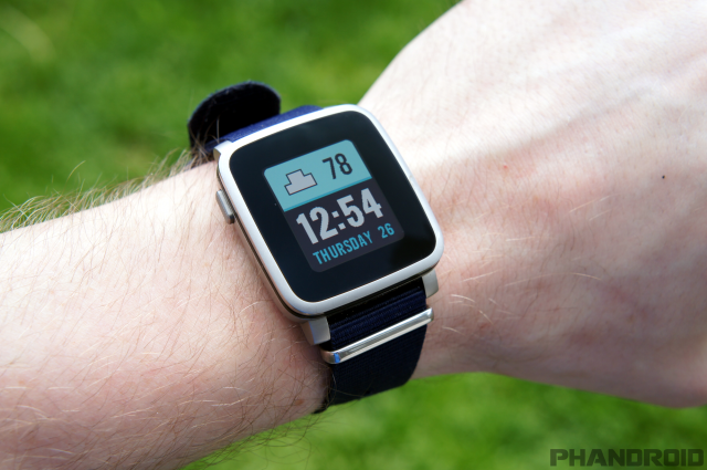
Pebble watches use an “e-paper” display, which allows them to be on all the time and uses very little battery. In my opinion, that is how a watch should work. Glancing at the time should be exactly that: a glance. There’s no wrist gymnastics involved. And just like a broken escalator can still function as stairs, a depleted Pebble still shows the time.
Another benefit of the e-paper display is visibility. LCD and AMOLED displays aren’t the best for outdoor readability. Smartwatches like the Moto 360 Sport attempt to solve this problem, but they still can’t compete with e-paper. The Pebble display is extremely visible in outdoor lighting like every watch should be.
Physical buttons are better than tiny touchscreens
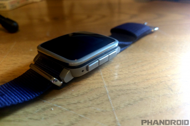
A staple of Pebble devices since day one has been physical buttons. Every Pebble watch has four buttons: Back, Up, Down, and Select. This is one of the biggest differences between the two platforms. Android Wear devices rely on touchscreens for input. While I’ll admit that touchscreens allow for more flexibility, I have found that I prefer the physical buttons and simple navigation of the Pebble.
Using a touchscreen on a tiny display can be a frustrating experience. There’s not a lot of room for swiping and scrolling, and sometimes they simply aren’t very accurate. Google has basically admitted this by adding “wrist gestures” for navigation. The buttons on a Pebble allow for very deliberate interaction, and it still works if you’re wearing gloves in the winter.
One of my favorite things about the physical buttons is shortcuts. The Up and Down buttons can be used to launch apps with a long-press. With a single long-press, I can quickly send a text to my wife or add something to my Wunderlist. Quick interactions are very important on smartwatches. I’ve found the Pebble to be the best in those situations. Some people think Pebble’s UI is too simple, but I think it’s perfect. If you can’t do what you want in a few button taps, it’s probably not something you should be doing on your wrist.
Notifications are just as good
A big thing with Android Wear devices is notifications. I will admit that Android Wear excels in this area, but Pebble is not as far behind as you might think. Pebble works especially well with Android phones, and Pebble even uses the Android Wear phone app to allow for more interaction with notifications.
Most notifications on Pebble offer a few options. Dismissing the notification will also dismiss it on your phone. You can also choose to “Open on phone.” Most messenger and email apps will give you the option to reply to messages, just like on Android Wear. You can choose from pre-written responses, emoji, or reply with your voice. This is pretty much how I would expect a smartwatch to work. Messages are the notifications I typically take action on.
Notifications on Android Wear devices definitely look a lot nicer, but Pebble is bridging that gap, too. The latest versions of Pebble’s OS include colorful icons and cool animations to show new notifications. You’re not going to get full-color photos of your contacts, but it’s just enough to make me happy.
Another big part of notifications is the way you feel them on your wrist. Pebble allows you to customize the vibration pattern for notifications, incoming calls, alarms, and the system. You can choose anything from a simple pulse to the Mario theme song. I love knowing what kind of notification is coming in without even looking at my watch, and I don’t need a 3rd-party app to do it.
Voice control in all the right places
Voice commands have been a huge part of Android Wear since the beginning. For a long time, this was something that Pebble watches couldn’t touch. The newer models finally added microphones and basic voice controls. The Pebble voice functionality is nowhere near as robust as Android Wear, but I’ve found it to be in all the right places.
I don’t think I ever used my voice to open an app on an Android Wear device. The only times I really used it was to reply to messages or say commands like “Send a text to my wife” and “Set a timer for 15 minutes.” These are things that I can do with the shortcuts on my Pebble. A long-press allows me to start a text, and I’ve put the Timer app just a couple button presses away.
Developers have also started to take advantage of the microphone. One of my favorite apps allows me to add an item to my grocery list in Wunderlist. All I have to do is long-press the Down button to launch the app and it immediately starts listening. I think a lot of Android Wear’s voice functionality goes unused by most people. Pebble hits the sweet spot for me.
Battery life is king
Now, for the reason you probably thought about when you clicked on this article: battery life. This is the one area where very few smartwatches can compete with Pebble. My Pebble Time Steel can go 10 days on a single charge. And that’s with the display being on 24/7. It’s hard to explain just how amazing that feels.
Most people have multiple devices that need to be charged every night. Smartwatches are just an extra thing to plug in. Every single time I’ve tried an Android Wear device I stop using it after a week or two because I forget to charge it. When I’m wearing it I constantly worry about the battery lasting me through the day. I do things like turn off the display to make it last longer, but that means I’m not getting the full experience of the device.
Earlier this year I went to CES for a week. I didn’t even bring the charger for my watch. That type of convenience is hard to beat. I never worry about the battery dying during the day or forgetting my charger when I go on vacation. I simply put it on in the morning and take it off at night. Just like any regular watch. When the battery does need to be recharged, Pebble gives helpful indicators. It will say “Powered till this afternoon” or “Powered till tonight.” If the battery gets really low it will turn off everything and just show the time.
Even before Pebble had voice controls and color displays, battery life was important enough that I used a Pebble Steel. All the newer features that bring Pebble closer to Android Wear are icing on the cake. I can deal with charging my phone every night, but I just don’t want that extra hassle with a smartwatch.
Pebble watches aren’t for everyone. It really comes down to what you want out of your smartwatch. For me, the Pebble excels at the things that are most important. I want a watch that can be on at all times, shows my notifications, and doesn’t need to be charged every night. I don’t need to do Google searches or make calls from my wrist. Sometimes less is more.
What are your thoughts on Pebble vs Android Wear? Which platform do you prefer? Have you tried both?








Comments