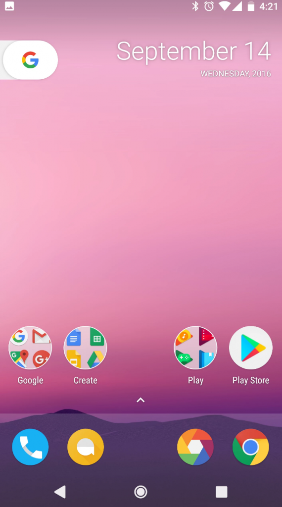
Rumors are flying surrounding the phones that Google plans on unveiling sometime in October. Last month, we learned that this year’s devices likely won’t bear the Nexus name, instead Google is switching to Pixel and Pixel XL. Now we’re hearing a bit more about the software side of things that are coming in the Android 7.1 update for the Pixel phones.
David Ruddock of Android Police has tweeted a mention of a new home button on the Pixel phones that replaces the long-used flower design we’re so familiar with today.
The main filled white circle, surrounded by a larger thin circle. When you hold it down, the 4 colored dots then come out.
— David Ruddock (@RDR0b11) September 14, 2016
To take that a step further, Ron Amadeo of Ars Technica decided to draw up a mock-up of what the new home button could look like, based on the description provided by David in his tweets. Here’s a quick peek at his speculative design.

The round icon design is something David mentions in additional tweets, stating that it’s something Google is considering forcing for all icons. Hardcore Android users have long given Google a hard time for not following its own Android design guidelines when it comes to icon size and several third-party launchers like Nova and Action 3 now include ways to normalize icon size because of this.
What do you think of the mock-up? Do you like round icons or would you prefer Google go in a different direction with the new home screen?


Comments