As Samsung often does, they’re refreshing their user experience and interface for Android 7.0 Nougat, which is currently in the beta testing phases. We’re not sure what, exactly,Samsung has in store for the update just yet, but we know they already had their own version of multi-window and can probably expect an improvement on it, and they’re likely to take some other Nougat features like icon actions and quick reply notifications.
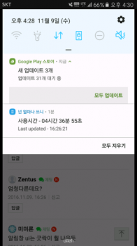
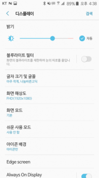
Today, though, we get our first glimpse of how things may look once it arrives. New screenshots of Samsung’s UX have surfaced. The company has seemingly redesign many of their apps and elements of the OS.
The previous iteration of their design introduced a flatter design philosophy, and Samsung seems to be taking that to a higher level. They’ve also redesigned many of their icons for things like quick toggles in the notification pane. We’d be lying if we said it didn’t feel a bit Apple-esque.
Samsung has had a tough history with TouchWiz with things like overbloat and ugly design turning many users off, but they have been steadily improving things over the past few years and we’re hoping this new Grace UX proves to be a big new turning point toward a better future.
[via SamMobile]








Comments