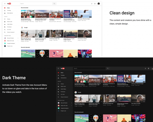
A few weeks ago, we learned of a way to view YouTube’s hidden dark mode, which required you to use your browser’s console mode. However, Google has introduced a redesigned interface for the desktop app and will even allow you to view YouTube’s Dark Mode natively without tinkering.

This is not an automatic change, all you’ll need to navigate to the Opt-in page to actually enable the changes. Google insists that this is just a preview phase for YouTube, as the company hopes to get some reliable feedback on how to improve the new interface for everyone.
Luckily, if the new interface isn’t your cup o’ tea, you can opt-out and get the old, boring interface back. In order to do so, you’ll need to follow the steps below:
- Navigate to ‘Account Menu’
- Select ‘Restore classic YouTube’
- Enjoy (or don’t)
The redesign adds a more ‘Material Design’ feel to it, and doesn’t feel like it’s stuck in the past. The Dark Mode may take some getting used to, as there isn’t much color other than black and white when navigating through your favorite channels. This is great for viewing content but may drive some away when navigating through the front page and channels.
[YouTube]


Comments