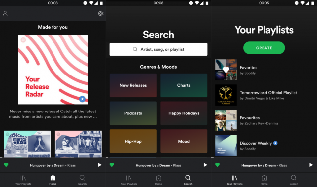
Some Spotify users are seeing a new three-tabbed UI for the Android app. The new UI aims to make things simpler by dividing the app into three sections. Instead of tabs for Home, Library, Search, Radio, and Browse, the new UI only has Home, Search, and Playlists.
The Search tab has been changed the most. It has been combined with the old Browse tab to consolidate things. This is where you’ll find the Genre and Mood sections. Other new features include bigger buttons on the Playlists tab, a list of your like, larger album thumbnails, and more minor tweaks. The update is being tested right now, but we don’t know when it will roll out to everyone.
[via Google+]


Comments