The midrange smartphone market is crowded. The options are endless, which is great for consumers, but it ends up being really hard for device makers. How do you stand out when you’re going up against LG, Samsung, Xiaomi, Huawei and others and trying to compete on price? What makes you stand out?
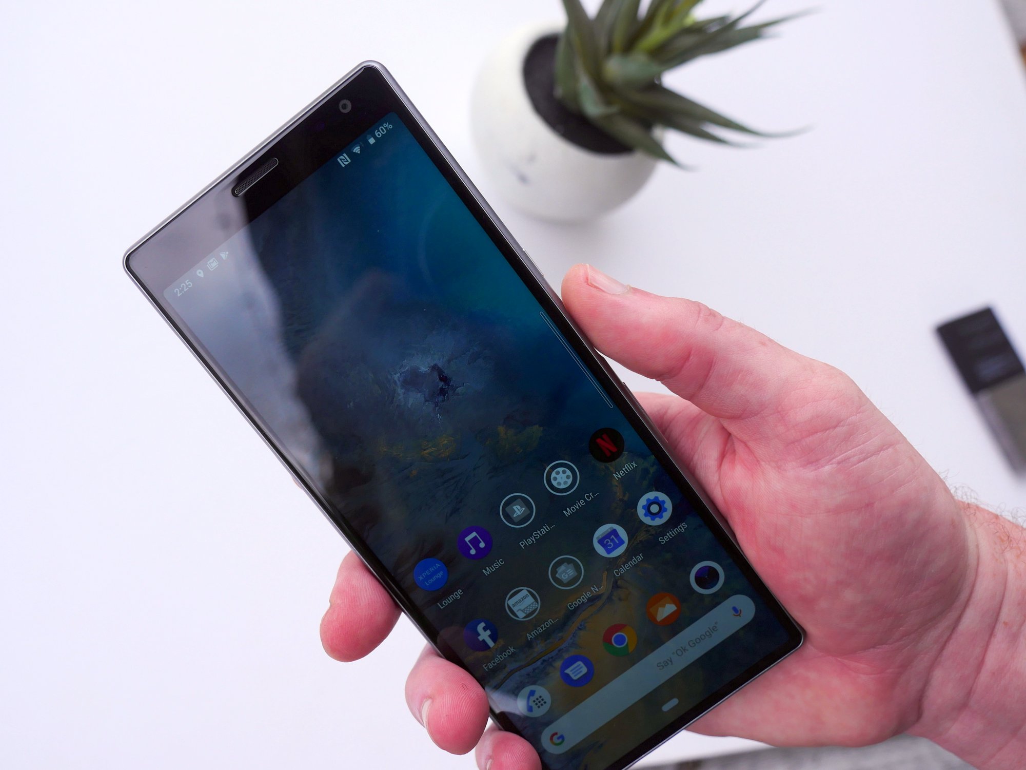
Sony took this question and came up with an interesting answer. For the first time, we’re getting phones with 21:9 displays on the front. These tall and skinny phones mimic the aspect ratios of movies you’d see at a movie theatre while other devices top out at around 19.5:9. Sony is betting on this distinct display to pull in new customers that want to display more information on their phones without using a device so big it won’t fit in their pocket.
Did they succeed? Nick Gray and I spent the last three weeks with the Sony Xperia 10 and Xperia 10 Plus. Here’s what we found.
Hardware and design
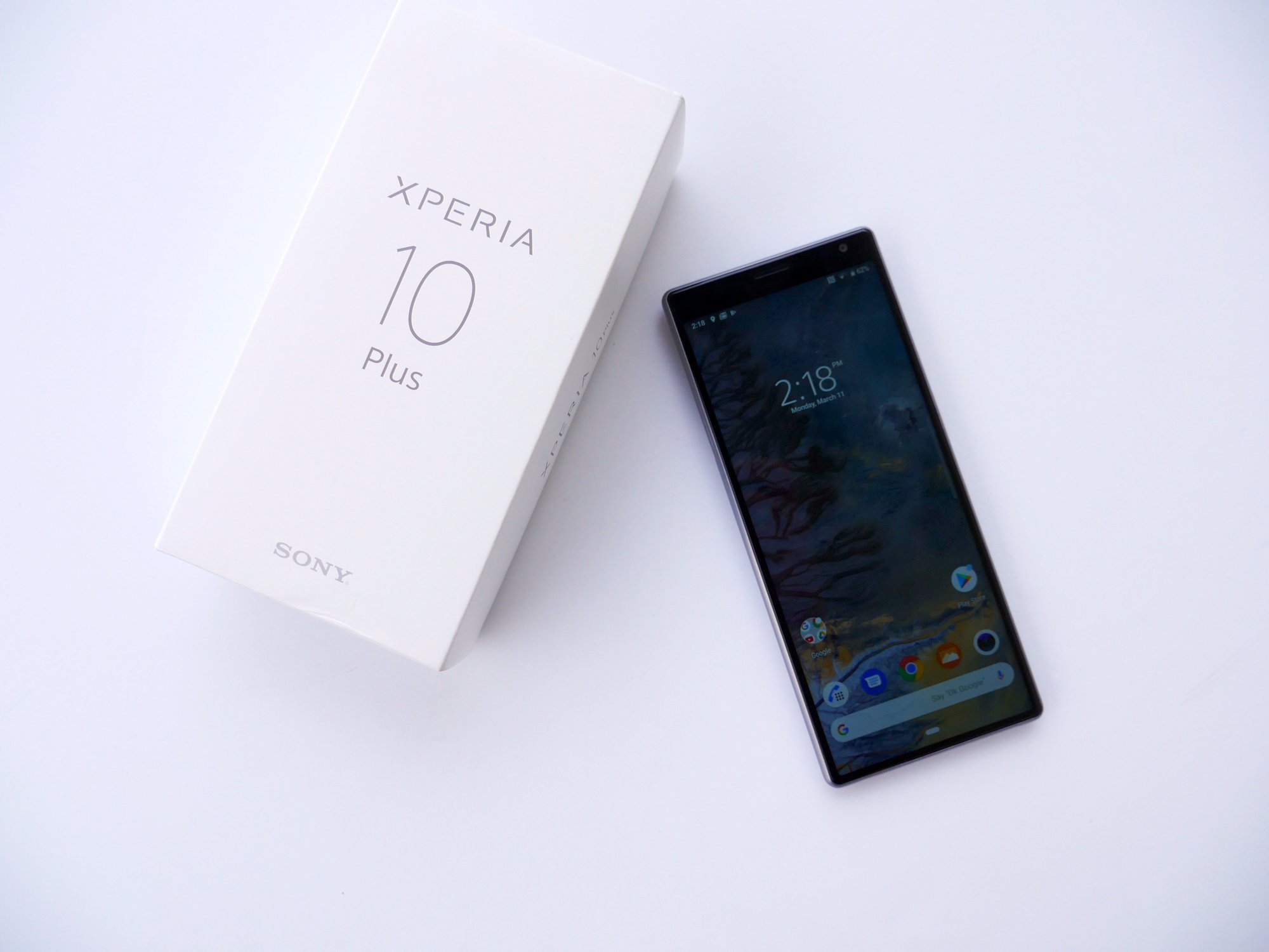
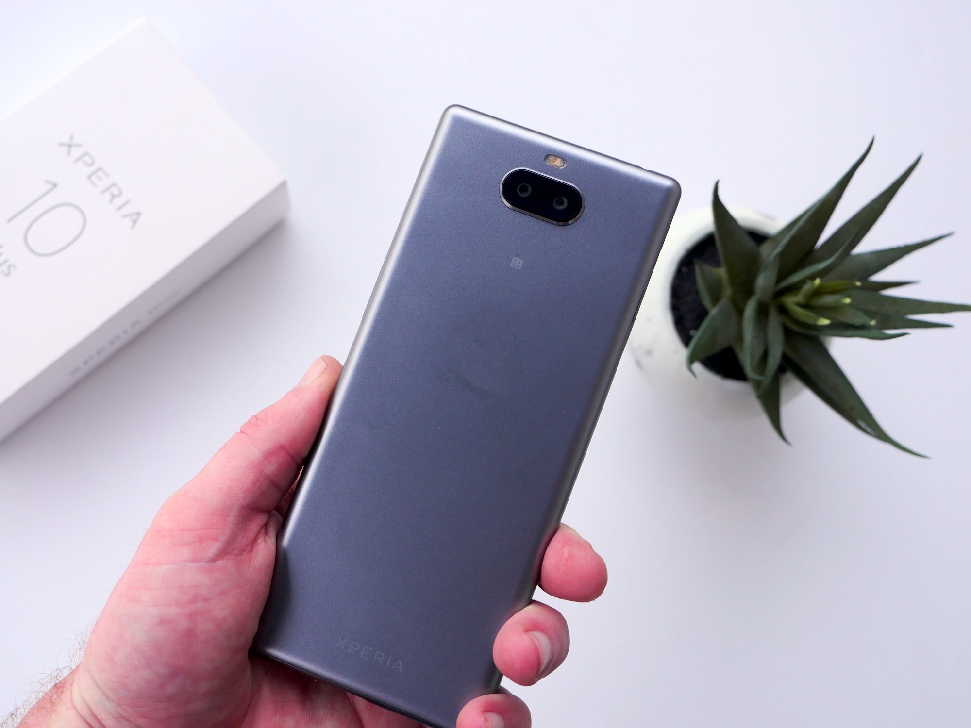
The most obvious thing about the Sony Xperia 10 is the new aspect ratio. Even if you knew nothing about the phone before picking it up, it’s obvious that there’s something different about this particular phone. The long, slender design combined with a hard plastic backing almost make the Xperia 10 and Xperia 10 feel like touch screen remote controls. It has that same kind of heft and skinny design that many of us 80s and 90 kids will remember from before a time when you could control your television with your voice.
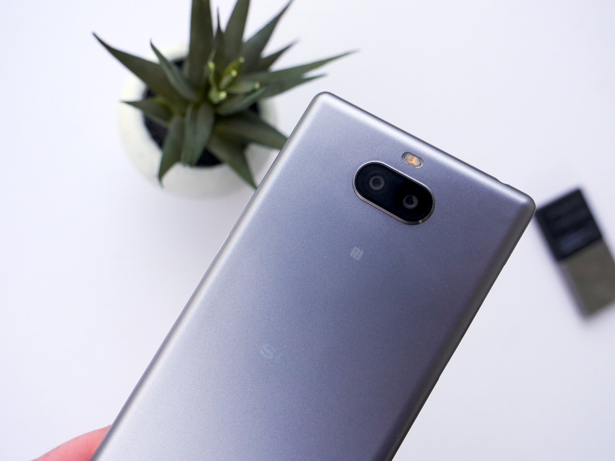
Some of the people that I’ve talked to about this phone have recoiled a bit when they read that the shell of the phone is hard plastic. I won’t lie, when I saw it on the spec sheet it instantly dropped my expectations of the device but I’m really glad I got one in hand because I’m actually enjoying using a plastic phone again. As I said, it’s hard plastic and it almost comes off as a unibody design much like the plastic successor to the HTC One lineup. It’s nice and smooth and can take a beating which is perfect if you’re purchasing this for a kid’s first phone or something sturdy for an elderly family member that could be prone to drops. Another huge advantage of a plastic build is the lack of fingerprints on the rear of the device. I do get pretty frustrated from constantly cleaning my phone and the Xperia 10 relieves this pressure.
BUY THE SONY XPERIA 10 PLUS
The right side of the phone houses the power button, fingerprint scanner, and volume rocker. It’s a pretty unique setup with the fingerprint scanner sandwiched between the two physical buttons. As for those buttons, they’re not great. They don’t stand up off the phone very far so they’re rather hard to locate, though they do give nice tactile feedback when pressed.
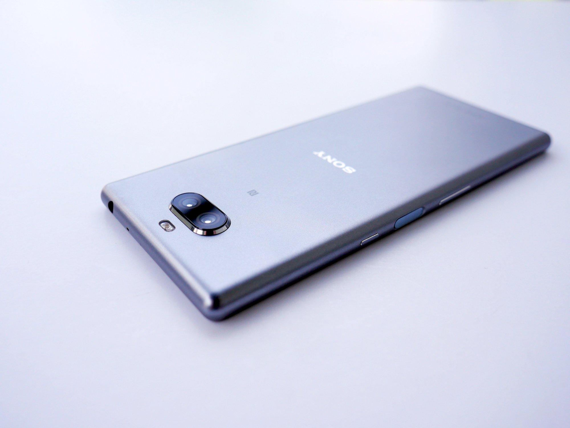
Due to these hard to locate buttons, the fingerprint scanner can be hard to locate as well if you’re not looking at it. Instead of sticking out from the phone, it’s concaved and works for both righties and lefties. It’s not the fastest or most accurate scanner in the world, but it does get the job done most of the time. Other times, it will just do nothing at all. It’s not that it isn’t getting a good scan, it’s just not scanning at all. That’s a frustrating issue that I hope Sony can address is a software update. And if they do, I hope they add in functionality to drop the notification shade by swiping down on the scanner as well. Quite a few phones with rear-mounted scanners have this feature and the Samsung Galaxy S10e, which also has a scanner on the side of the phone, does as well. With a phone this tall, it’s very helpful to have features that help you access elements that are at the top of the screen. This is one Sony should consider high priority.
I was surprised the first time I picked up the phone because it feels top heavy. I’ve owned Sony devices in the past which had fantastic balance. The company received criticism for some past phones being bottom heavy (Sony Xperia Z2) but it had seemed to have figured this out in its most recent devices. I hesitate to speculate on why this is going on, but I feel most people will blame the rather large top bezel the phone sports. Luckily for users, you stop noticing that big bezel after a few minutes of use and the rest of the are adequate for the price range.
BEST SONY XPERIA 10 CASES
Along with the large bezel, some people are turned off to Sony’s return to a blocky design language. Sony execs told us that they were evolving their design language but the Xperia 10 does feel like a return to the comfortable for the company. There’s no curved back like we’ve seen in recent Sony devices and the phone just feels like there’s very little subtlety about it. While phones like the Samsung Galaxy S series have popularized curved edges, Sony is sticking with an old design language that feels closer to the Razer Phone.
But sticking in the past may not be the worst thing in the world. If it means that we get to keep the headphone jack long term, then I’m okay with it. The top mounted headphone jack is both in the perfect position and provides an excellent wired headphone experience. I don’t know what tricks Sony has up its sleeve here, but the Xperia 10 sounds better with my wired headphones than other devices with similar or the same chipsets. Unfortunately, the bottom firing speaker falls flat. It gets high marks for how loud it can get, but the audio quality– especially at higher volumes– falls flat.
Specs
| Sony Xperia 10 | Sony Xperia 10 Plus | |
|---|---|---|
| Display | 6-inch, 2520×1080 IPS LCD | 6.5-inch 2520×1080 IPS LCD |
| Processor | Qualcomm Snapdragon 630 | Qualcomm Snapdragon 636 |
| RAM | 3 GB | 4 GB |
| Storage | 64 GB | 64 GB |
| Battery | 2,870 mAh | 3,000 mAh |
| Main Camera | 13 MP f/2.0 + 5 MP f/2.4 | 12 MP f/1.8 + 8 MP f/1.8 |
| Front-facing Camera | 8 MP f/2.0 | 8 MP f/2.4 |
| Connectivity | Wi-Fi 802.11 a/b/g/n/ac, Bluetooth 5.0, A2Dp, aptX HD | Wi-Fi 802.11 a/b/g/n/ac, Bluetooth 5.0, A2Dp, aptX HD |
| Software | Android 9.0 Pie | Android 9.0 Pie |
| Dimensions | 155.7 x 68 x 8.4 mm | 167 x 73 x 8.3 mm |
| Weight | 162g | 180g |
| Colors | Black, Blue, Silver, Pink | Black, Blue, Silver, Gold |
| Price | $350 | $429 |
Display
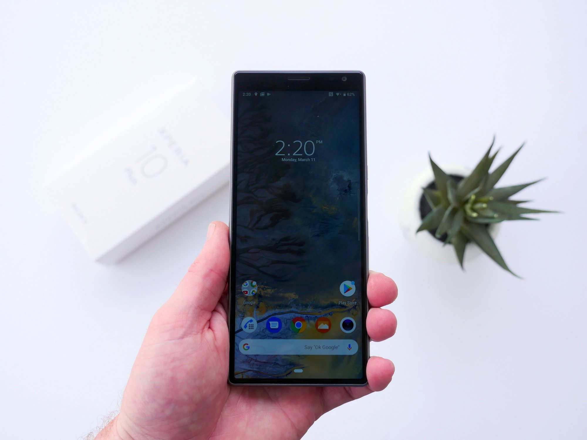
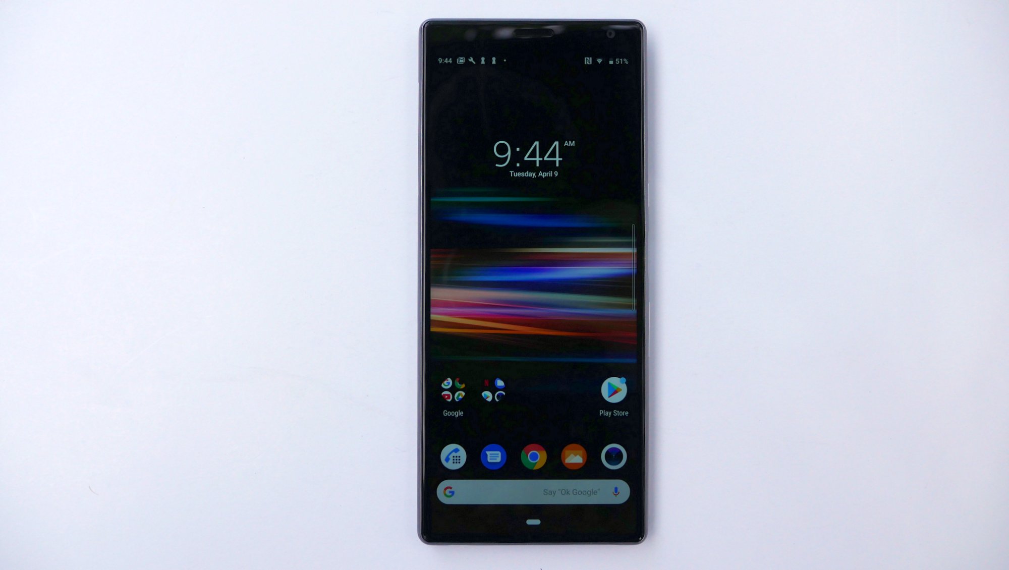
Both the Sony Xperia 10 and Xperia 10 Plus feature IPS LCD displays with the slim 21:9 ratio. The Xperia 10 is the smaller of the two coming in at 6-inches with a 2520 x 1080 resolution, good for 457 PPI. The Xperia 10 Plus stretches that out to 6.5 inches but keeps the same 2520 x 1080 resolution which means the pixels per inch drops down to 422.
I am going to go on record here saying that I actually like the 21:9 aspect ratio. While I don’t think that there’s a massive advantage to it when viewing media, it is more comfortable in the hand because it’s a lot easier to reach elements on the left side of the screen when holding the phone in my right hand. I can also reach higher, which is great, although I cannot reach the top of the screen on the 6-inch Xperia 10.
My biggest issues with the displays are their (lack of) quality. I’m not going to ding them for going with IPS LCD panels because LG proves year after year that LCD panels can be beautiful too. No, my biggest issue with these displays is the ghosting and dull colors. I was really shocked that there was any ghosting at all here as that’s not something I’d seen on a phone in quite a while. The dull colors, on the other hand, are pretty common in some LCD displays. While not shocking, it is still pretty disappointing. You can mess around with the color gamut and contrast in settings but your options are “Off” for no image enhancements, “Standard mode” for a small boost in colors and “Super-vivid mode” where Sony really tries to blow up the colors on the phone. None of them look great and I’m rather disappointed in this display, even for a mid-range device.
If the dull colors and ghosting weren’t bad enough, this thing is a massive fingerprint magnet. I praised Sony earlier for the plastic backing not picking up smudges but it seems like they’re all transported to the front of the phone because I constantly have to wipe this thing off. I’m a pretty clean person but this display feels and looks gross when it’s being used. I don’t know if Sony decided to drop the oleophobic coating on this phone or what, but it’s not a good look.
The brightness floor and ceiling are both pretty good, which somewhat surprised me since I was so disappointed in the display in other areas. Turning the brightness all the way down makes for a comfortable experience when using the phone in bed and turning it all the way up provided a halfway decent experience when I ventured outside. You’re not going to get max brightness like a Samsung or LG flagship, but you can at least see what’s going on in direct sunlight, provided that your phone isn’t filled with finger grease.
If you don’t have great eyesight, I would caution against buying an Xperia 10 or 10 Plus before you see one in person. One of the consequences of a slimmer display is that text looks squished and small and it can be hard to read if you don’t have great eyesight. There’s no real way around this issue with a slim phone but you can change the font size and design elements like on most phones. It can make some apps look a little goofy but at least you can read what’s on the screen.
The real reason you’re going to buy a phone with a 21:9 aspect ratio is so you can fit more on the screen vertically. Apps that haven’t been updated to work with longer aspect screens will show a massive black box at the bottom of the screen. And while that stinks, those are few and far between. I only found a couple in my few weeks with the phone and I could still operate the apps just fine, it just didn’t look that great.
But, apps that stretch out look fantastic. You can get a ton of content on the screen when scrolling through a timeline-based app like Twitter or Instagram. While there’s not a practical advantage to this, it does make for a more enjoyable experience. Viewing 21:9 media is also a true pleasure here. Anything shot in 16:9 will display black bars on the sides of your screen but you’ll hardly notice them. Sony included a 21:9 trailer for Spider-Man: Into the Spiderverse and it really makes you eager to watch other 21:9 content. Sony says that they’re going to kick the tires on making that kind of video available to Xperia 10 and 10 Plus owners ASAP. You can find some movies in 21:9 now but they’re far less popular than 16:9 (standard for televisions and monitors) versions right now.
Sony’s bet on a longer aspect ratio may not pan out in the long term, but I do like that they’re taking a chance on it right now. You do feel more immersed when using the phone and I found myself using social apps a little bit longer because there’s almost always something interesting at the bottom of the screen to keep my scrolling. I’d love to watch full movies on this too, if I can find them.
Battery
Battery life is easily one of the strongest selling points of the Sony Xperia 10 and 10 Plus. The 10 comes with a 2870 mAh battery while the Plus packs in a 3,000 mAh battery and both support Qualcomm Quick Charge 3.0.
2,870 and 3,000 mAh batteries aren’t huge by today’s standard but they get the job done. I saw an average screen on time around 5 hours with heavy usage and around 15% battery left at the end of the day. I did have a few days where battery life wasn’t as good but I believe it’s because I was outside a lot and had the brightness cranked up. On the Xperia 10 Plus, the 3,000 mAh battery isn’t great considering the size of the display. Typically larger phones get better battery life due to their larger batteries, but the difference between the two is so small that battery life on the larger 10 plus is worse than the smaller Xperia 10. We averaged 4 and a half hours of screen on time on a single charge, sowe recommend topping things off half way through the day or making sure you’re near a charger late in the day.
Interestingly, while the phones support Qualcomm’s Quick Charge 3.0 technology, the wall bricks that come with the phones do not. I was able to fast charge with other cables and wall adapters but not the ones included in the box, which is disappointing to say the least.
The Xperia 10 and Xperia 10 Plus also do not support wireless charging, a feature we would’ve loved to have seen since we’re not dealing with metal phones. Once a premium feature, wireless charging has shown up in quite a few budget devices over the past few years and it’s really a shame that Sony decided to exclude the feature here.
Camera
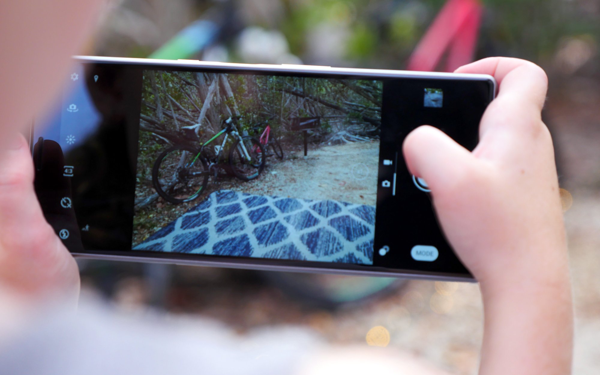
While Sony is known for creating some of the worlds best camera sensors, the company has struggled to deliver a stellar camera experience on its own smartphones. Of the two devices, the Xperia 10 Plus has the better camera setup with a 12MP main camera which is paired with an f/1.8 lens, a secondary 8MP sensor and telephoto lens, and an 8MP front-facing camera.
The overall image quality from the main camera is good when taking pictures during the day. The colors a well saturated and the software does a good job of keeping things even on white balance. That being said, dynamic range is a bit of a disappointment, leaving you with blown-out highlights and dark areas on your shots. The main lens is quite sharp, providing a lot of detail, but that can’t be said for the telephoto lens that’s paired with the 8MP sensor. This second camera is mainly used to portrait shorts if you want to separate your subject from the backgrounds with digital blur, but you’ll be left with images which lack the detail that you get from the main sensor. The good news is that Sony’s software does a good job of distinguishing the background from the foreground, delivering images which you and your friends will love (as long as you’re not looking too closely.
In low light situations, the two cameras on the back of the Xperia 10 Plus falter quite a bit. The images produced by both camera are dark and grainy. If you have a steady hand, you can improve things a little by switching to HDR mode, but there’s honestly nothing you’ll be able to do to content with the blown out highlights whenever a light direct light source is captured in the shot.
Those who love snapping selfies will be able to get by with the 8MP front-facing camera. Sony’s built in a very useful hand-detection timer for selfies which allow you to raise your hand into the shot which will them trigger a 2-second times before capturing your shot. Very helpful if you’re constantly struggling to adjust your phone to get the right angle while also trying to somehow press the shutter button.
As for image quality, the selfie cam offers decent dynamic range and there’s a surprising amount of detail, as long as lighting conditions are good. Turn the lights down and the selfie camera falls apart just like the cameras on the back. You can always use the screen flash to brighten things up, it doesn’t always look right.
On the Sony Xperia 10, you get all the same software features as you do on the 10 Plus, but the sensors Sony has used are a half a step-down. The phone uses a 13MP and 5MP dual camera setup on the back and an inferior 8MP sensor for selfies.
As you can expect, the images from the Xperia 10 are not as good as what you get on the 10 Plus and are actually quite disappointing when you compare them to other smartphones in the $350 price range. Detail is alright at best but colors don’t seem very accurate. The main camera also keeps the shutter open longer than it should, leaving you with motion blur if your hands aren’t really steady or if your subject is moving around.
The results are good enough for your Facebook feed or even Twitter but don’t expect anyone to ask you what camera you’re using. If you’re looking for a cheap phone with a decent camera, we suggest you look elsewhere or spend the extra $80 to get the Xperia 10 Plus since there’s a noticeable difference in image quality between the two.
Software and Performance
The Sony Xperia 10 and 10 Plus run a pretty close to pure Android build. Out of the box, they come with Android 9.0 Pie, the most up to date software out right now. Sony has never been known for heavy customizations in its UI skin and the company has stayed the course with the 10 and 10 Plus. If you’re an Android purist, there’s a lot to like here.
As phones have moved on from the old 16:9 display aspect standard, app developers have had to adapt. Most apps you’ll download in 2019 will stretch to pretty much aspect ratio you can think of. But, those that don’t create a pretty big problem on the Xperia 10 and 10 Plus. Several apps (most notably Timely, my alarm app) have a gigantic black bar at the bottom of the phone. The app fills the top 60% or so of the phone’s display with nothing under it. It obviously looks terrible and the usability isn’t great but these examples are few and far between.
We did run into some more bugs in the system like the stock launcher duplicating application icons within folders on the home screen and icons showing up very low res and pixelated. Again, these issues didn’t happen often but they’re frustrating when they do and don’t give you the feeling that you’re working with a premium device.
Due to the slower processor, there’s lag just about everywhere in the system. Scrolling through long lists like Twitter and Reddit saw quite a few frames drops every time something new was loaded. When you design your phone around fitting more elements vertically on your screen, it’s not a great look to have your phone slow down and freak out when new items are being loaded as you scroll down.
Additionally, background restrictions seem really strict here. I couldn’t load more than three or four apps tops into memory with the Xperia 10’s 3 GB of ram. That really should be more than enough RAM to avoid any problems, especially because I was running pretty light apps like Sync for Reddit, Slack, and Dark Sky. I had a few instances of music applications playing in the background being killed while I listened to music and that’s unacceptable in 2019, no matter how much the phone cost.
As I said earlier, you get a pretty close to pure Android build here which leaves a lot of room for customization. The flipside of that coin is that there aren’t a lot of features built into the OS. There isn’t an always-on display, lift to wake or double tap to wake at all here. While that’s not a huge issue for some people, I rely on that feature in pretty much every phone I use and its absence was definitely noticed.
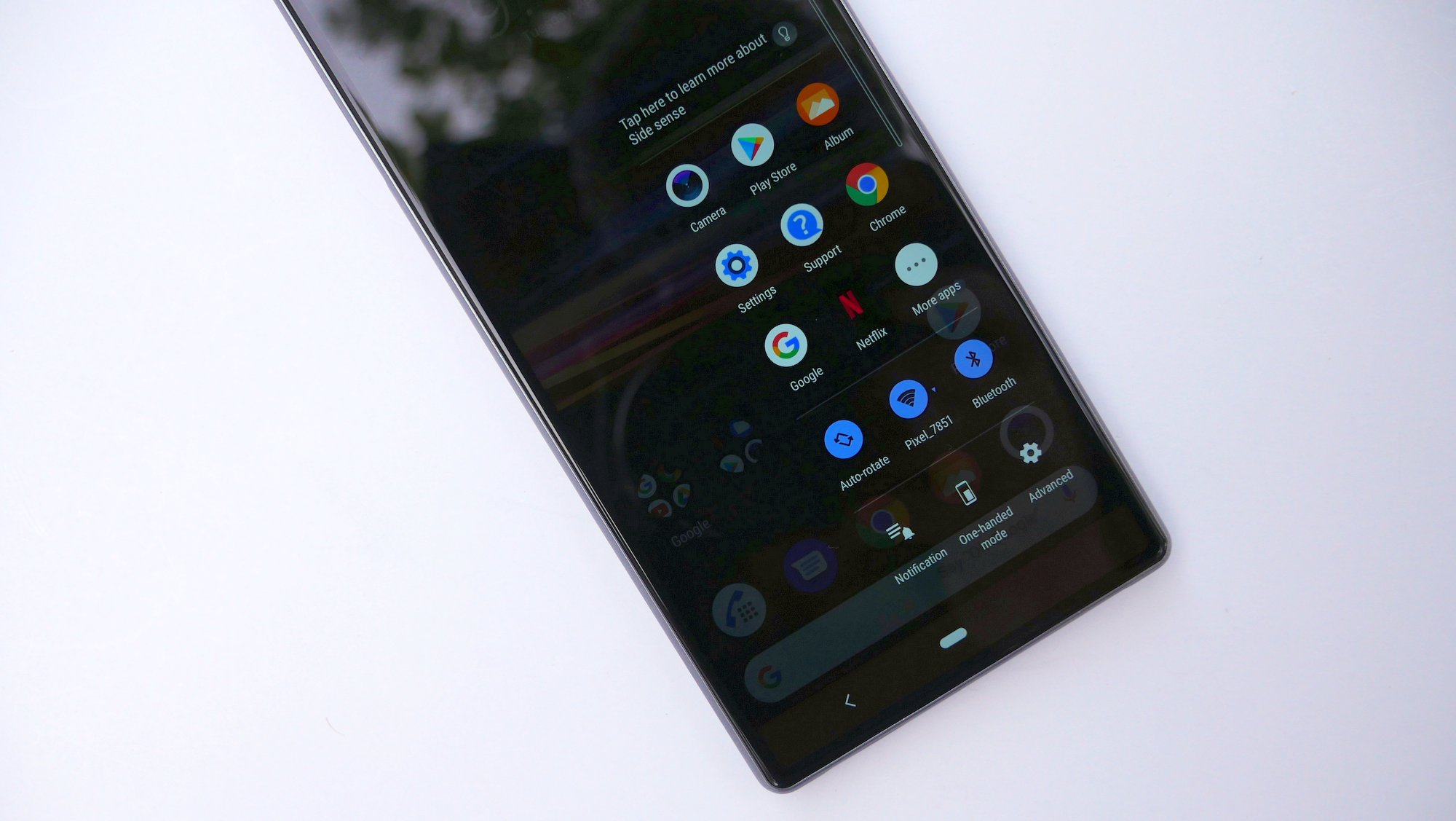
Sony did include some features of its own like Side Sence, which is a nice little quick access tray on the right side of the screen. Double tapping it brings up a list of suggested apps that the system finds through your usage history. The list is pretty big and almost every application I use on a daily basis was here. This is a lot like the feature you can find in Samsung phones but I like it a lot better here. If you don’t like it, you can just turn it off.
Battery life is pretty good here but Sony improves two power saving modes that will get the most out of your power pack by sacrificing performance. Since performance isn’t great to begin with, it hurts to use them but they’re excellent in a pinch. I also really like Sony’s one-handed mode… in most of its phones. Here the icons and text are so small because it’s already a pretty skinny device that it’s really hard to navigate. I think Sony should’ve tried to rethink one-handed most on these new Xperia devices rather than sticking with what it has done in the past.
Overall, there’s a lot to like with Sony’s software if you prefer light UI skins. If you’re a person who prefers the feature-packed Samsung and LG skins, this might not be for you, but this would be a great option for someone who dreams of owning a Pixel device but doesn’t quite have the budget for it. Sony also has a pretty good track record with software update speed so you know that when you’re purchasing an Xperia device, you’ll be taken care of with both major OS updates and security patches alike.
Conclusion
The Sony Xperia 10 and 10 Plus are a bit of mixed bag, just like most mid-range phones. There’s a give and take any time you’re trying to keep the cost down and Sony does an admirable job here. Unfortunately, the areas where they cut corners appear very obvious to users. The display, while cool, is just not good enough. I really do like the 21:9 aspect ratio and I think it’s the future, but the overall dull colors, the ghosting, and lack of an always-on display are serious drawbacks.
Software and performance is also an area where I hope Sony can improve this phone with an update. I’ve used many devices with the Qualcomm Snapdragon 636 SoC powering the Xperia 10 and this is one of the worst performers. Normally we chalk that up to a heavy software skin and lots of apps running in the background, but I don’t think that’s the case here. We may just be looking at poor optimization, and that’s something Sony can work on in the future.
If you’re purchasing a phone to use for the next several years, I’d caution against picking up the Xperia 10 right now. I think there’s a lot of untapped potential with this phone, but right now, it’s probably best to look in another direction. If Sony can figure out its software, the other negatives are a lot easier to deal with.
If the Xperia 10, 10 Plus, and 1 are a roadmap of where Sony is headed, I’m excited for the company. It seems like Sony really wants to be a player here in the states and as such has signed a deal with Verizon to sell the device. You can also pick the phones up right now at either Best Buy or Amazon with the Xperia 10 running you $349.99 and the Xperia 10 Plus at $429.99. I think there are better options at that price and Sony would be wise to drop the price between $50 and $100 per device.
SONY Xperia 10 Rating: star_fullstar_fullstar_fullstar_25star_0 (3.25/5)
The Good
- Sony’s software is better than most despite a few glitches
- Sleek design which stands out from the crowd
The Bad
- The camera experience is sub-par
- 21:9 display is awkward at best
- sluggish performance
Final summary
SONY Xperia 10 Plus Rating: star_fullstar_fullstar_fullstar_25star_0 (3.75/5)
The Good
- Sony’s software is better than most despite a few glitches
- Sleek design which stands out from the crowd
- Decent camera for the price
The Bad
- 21:9 display is awkward at best
- sluggish performance
Final summary










Comments