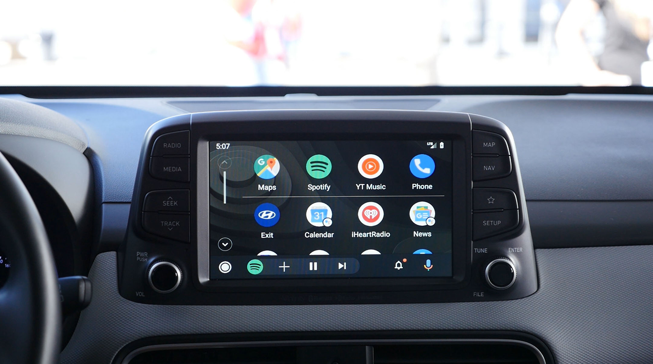
The Android Auto redesign was announced at Google I/O and is really exciting because it looks to be a huge upgrade over what we have now. Let’s be real, Android Auto is clunky and pretty ugly.
The new version trades in the pastel colors for a sleek black look, better matching a factory car interface. Pausing a song no longer requires you to leave your maps, as there are now music controls in the bottom bar. There are a lot more changes done to the system, so check out our hands on!
This redesign was set to launch during the summer of 2019 and people are finally starting to see it. Some users are reporting that the app version 4.5.5928 is getting an option to try the new interface. If you’re not seeing it, you can try clearing data on the app and the prompt might appear in the settings.
Unfortunately, this won’t work for everyone so most people will continue to have to wait for it to roll out more widely. I’m still waiting with bated breath. Hop into your car to check for the new interface and let us know when you get it!
Source: Android Police


Comments