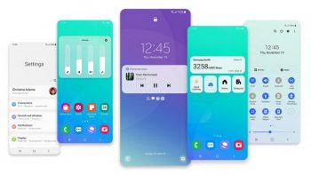
Best features included in Samsung’s Android 11 with One UI 3.0 update
Unless you own a Google Pixel handset, you typically have to wait a while before your handset’s manufacturer is able to push out the official Android update for your device. This is because a lot of handset OEMs love including their own skins and UIs to make the phone a bit more unique, but this also means that they’ll need to update their UI to ensure compatibility.
Such is the case with Samsung, who recently started to roll out its Android 11 update with the One UI 3.0 interface. There are a lot of changes, obviously part of it has to do with the new features and improvements from Android 11, but also with One UI 3.0, Samsung has made their own tweaks.
If you’re a Samsung handset owner with a device that’s eligible for the update, then here’s what you can look forward to once the update is made available to you.
A brand new UI
With One UI 3.0, Samsung has introduced a new and improved look to its smartphones. The new UI doesn’t revamp the previous UI, but rather improves on it. This is a good thing since we’re sure that users probably don’t want to have to get used to a brand new look, plus there was nothing wrong with the old design, so improving on it makes more sense.
The new UI comes with a bunch of new home and lockscreen widgets, a new dimming/blurring effect for notifications, and Samsung has also made some improvements to how it handles notifications and quick panels. Samsung has also moved around some of the UI elements like Device and Media shortcuts, the clock, and more, and hopefully it will now be better positioned so that you can access it easily.
There have also been changes made to the app drawer which now better matches the overall look for One UI 3.0. The way One UI 3.0 handles folders have also been improved, where instead of displaying 16 icons at once, which can look cluttered and make it difficult to find apps, it now only displays 12 apps with enough gaps in between to make each app more distinct.
Making day-to-day use easier
They’ve also made improvements to how message notifications are displayed, where the company says that they’ve made these notifications grouped and placed front and center so that it is more intuitive.
A better native camera app
It will help users organize their photos better and will also be able to show related photos in case you can’t find the one you’re looking for or if you want to see what else you’ve taken. Samsung has also introduced non-destructive photo editing where users can quickly and easily revert their photos back to original form in case they made a mistake or changed their minds during the editing process.
Better screen time management
Digital wellbeing is important which is why companies have introduced tools to let users check how long they’ve been using their devices, which apps they spend the most time on, and so on. Samsung’s One UI 3.0 will improve on that by introducing new digital wellbeing applications that lets you identify your habits.
It can show you the changes in usage patterns for the week, or how often you check your phone while driving. This is important because if you find yourself using your phone a lot while you drive, then maybe this awareness can help you cut back on that dangerous habit.