Pretty much all of Google’s major apps have been updated to feature some type of Material You-inspired widget, including Gmail. However, when Android 12 was officially launched, Google teased a different type of widget for Gmail. There was already a new widget available before, providing the rounded edges and matching themes that we expected. But this new widget looked to make email triage even easier to handle.
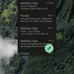
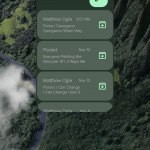
According to 9to5Google, this new widget is now rolling out with version 2021.10.31 of Gmail with a design looks pretty similar to that of Google Keep. But the real story here is that in addition to the FAB button being moved to the top right corner in the header, you are now provided with more control over your emails.
Next to each email in your Inbox, you’ll now find an archive button that will get rid of the email when tapped. This isn’t like some of the iOS widgets that put show a button only to force you to open the app anyways. Instead, you can actually and properly manage your Inbox right from your home screen.
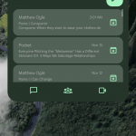
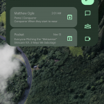
There’s a bit more fun to be found when you play around with the sizing of the widgets, as expanding the widget horizontally will show three shortcuts at the bottom. Tapping one of these will take you right into the Chat, Spaces, or Meet tab in the Gmail app. And if you happen to shorten the widget, the three buttons are placed beneath the FAB on the right side of the widget.
We have yet to receive the update on our Pixel 6 Pro just yet, but it is now rolling out on the Play Store. Or, you can head over to APKMirror and sideload the APK yourself if you don’t want to wait.








Comments