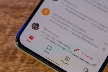
Google is bringing a completely new Gmail interface to the web
The past year has been quite impressive for Google from a software perspective, as the rollout of the Material You design language continues to make waves. From widgets and buttons with rounded edges to bringing the same design across a multitude of apps, Google is again attempting to create a completely unified experience.
It seems that the next step in the Material You takeover will actually take place in your browser on your computer. In a blog post, Google detailed numerous changes that are coming to the Gmail web client. By in large, your Gmail page will function the same as it does now. However, there are a few new features coming in addition to the Material You design changes.
This unified interface is being called the “New Integrated View for Gmail”, combining the likes of Mail, Chat, Spaces, and Meet all within the same interface. Google shared a screenshot of what the interface will look like once it’s made available for everyone. In the sidebar will be buttons for Google’s four big communication services, while providing quick access to a few shortcuts at the bottom.
Being able to ditch the extra browser windows or tabs just to handle the different Google services is going to be a huge boon for productivity. You will finally be able to use a single tab to navigate and communicate between the different services.
At first, users will be able to opt-in to the changes via a dialog box that will appear in the bottom right corner when you load up Gmail on the web. This testing period will commence on February 8th, but Google plans on making this the default view in Gmail by the end of Q2 2022. There will be a little bit of an adjustment period, as Google also detailed that those who have not opted in by April 2022 will begin “seeing the new experience by default, but can revert to classic Gmail via settings.”