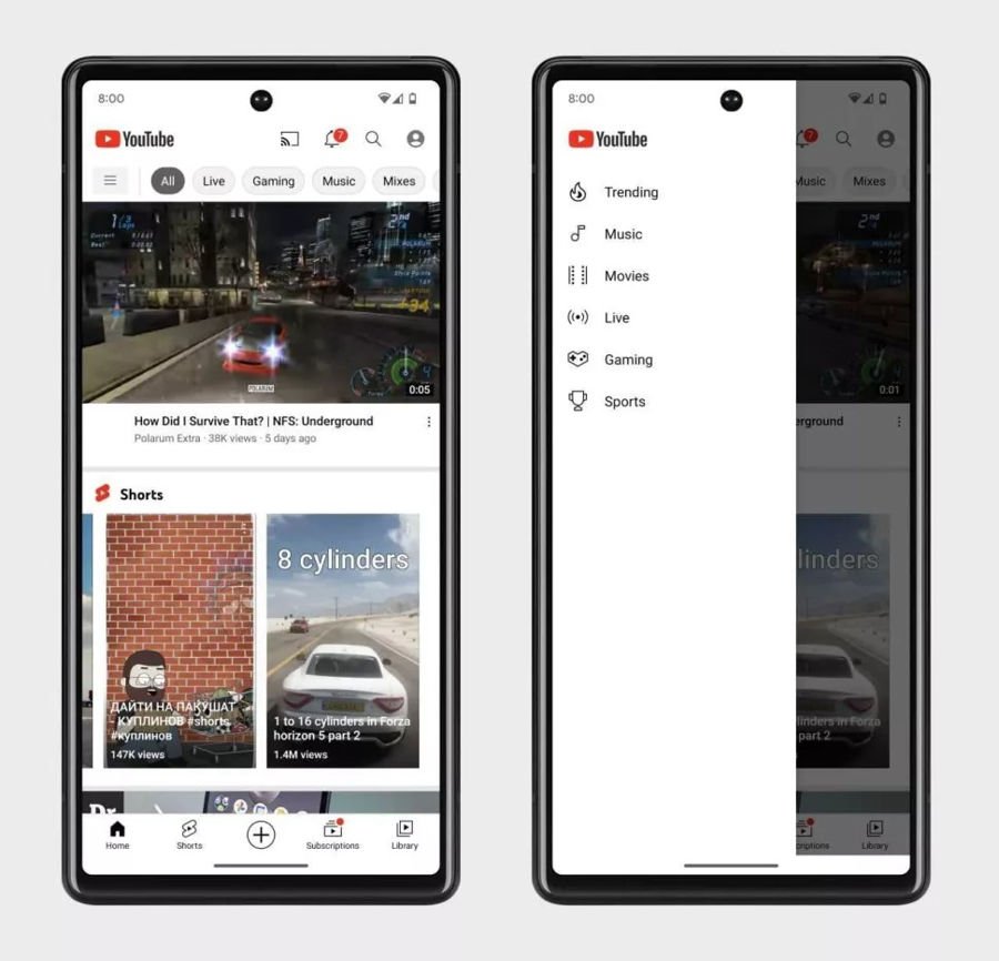
On the YouTube app for Android, at the top of your home page, there is an Explore button. Tapping on it will take users to a dedicated page where they will be able to find new content to consume, but it looks like the Explore tab could potentially be going away in a future update to the app.
According to the Google News Telegram account, it seems that Google is testing out some design changes to its Android app where the Explore tab on the home page will be removed. Instead, Google will be introducing a navigational panel that can be accessed from the side and will display different types of video categories, as you can see in the screenshot below.
 The categories of videos, as some of you might have noticed, are essentially the same as when you tap the Explore tab in the current version of YouTube, except that users will now be able to access all them from the side. We’re not quite sure what the point of the change is because overall, you would still need to make at least one action before accessing these categories, so it’s not as though it will be more efficient.
It is possible that Google wants to make it easier for users to jump directly into the categories they want instead of mindlessly scrolling, but that’s just speculation on our end. There’s no confirmation if this feature will be rolled out to the public as it will presumably be based on the initial feedback Google receives, so we’ll just have to wait and see.
Source: Android Central


Comments