Like a lot of apps and software, changes to the UI are generally a gradual process that takes place over the years. For the most part, WhatsApp’s UI has stayed quite similar over the years with some tweaks and improvements here and there, but it looks like the company could be working on a big revamp.
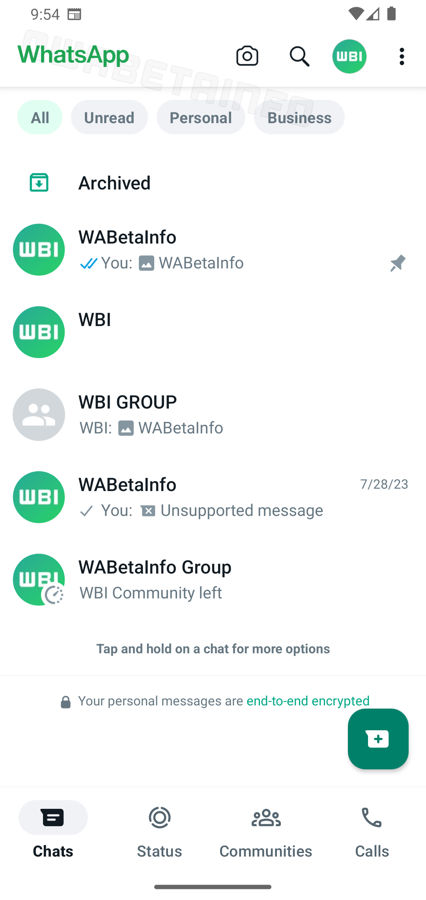
According to a report from WABetaInfo, they have spotted some of these potential changes, as you can see in the screenshot below. For starters, WhatsApp appears to have removed the word “Chat” at the top and replaced it with the “WhatsApp” name. The status bar has also changed to become white, and now it looks like there are filter tabs that you can use to sort your messages.

Image credit – WABetaInfo
Take note that this is the Android version of WhatsApp, whose UI is slightly different from the iOS version, but as WABetaInfo notes, WhatsApp appears to be trying to get the UI of both apps to look more uniform with each other. There is no word on when these changes are expected to roll out, so we’ll have to wait and see.
In the meantime, how do you feel about the upcoming changes? Is this new look something you look forward to, or do you prefer the older look?
Source: WABetaInfo


Comments