The Motorola Devour sitting next to the Nexus One… what a beautiful sight:
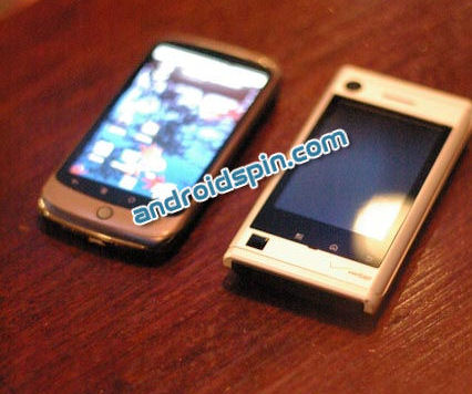
It looks physically bigger than the Nexus but the screen size is smaller. And if you peak at the keyboard, the whole package kind of makes me think that the Motorola Droid had sexy-time with the T-Mobile G1 and the Motorola Devour is the result. What say you about that?
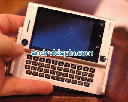
The device you’re seeing is apparently a prototype and the source didn’t offer much in the way of opinions/thoughts on using it. But if you want to see more pictures from the hands-on there are a bunch. Check them out at AndroidSpin.








one word: fugly.
i looked at the picture and thought, “is it still in its packaging?” hahhaha!!! FAIL!!
Who could possibly want this? With the all the money invested into designing/developing/advertizing something that looks even more dated than the near-obsolete components built into it, why wouldn’t moto instead just lower the price on the Droid to make it more accessible to the masses. I don’t get it.
I could see this being a great starter smartphone as long as it’s between Free and $49.99 (probably after rebate).
The KB looks miles better than the Droid’s KB. But the rest of it, not so much.
okay that looks almost exactly like the slidekick slide that t-mobile used to sell. which was made by moto also. maybe they just reused that design
i mean to say sidekick slide with android ontop
its ok but it will never replace my Nexi1
Motorola makes some ugly phones and once again they exceeded my expectations with this phone. They need new designs or something I will def be waiting for something else.
I was hoping it would look more like the Droid but this doesn’t look good at all. Maybe if it had a bigger screen I’d get it because I like a full physical keyboard but I think I’ll just stick with my Nexus 1