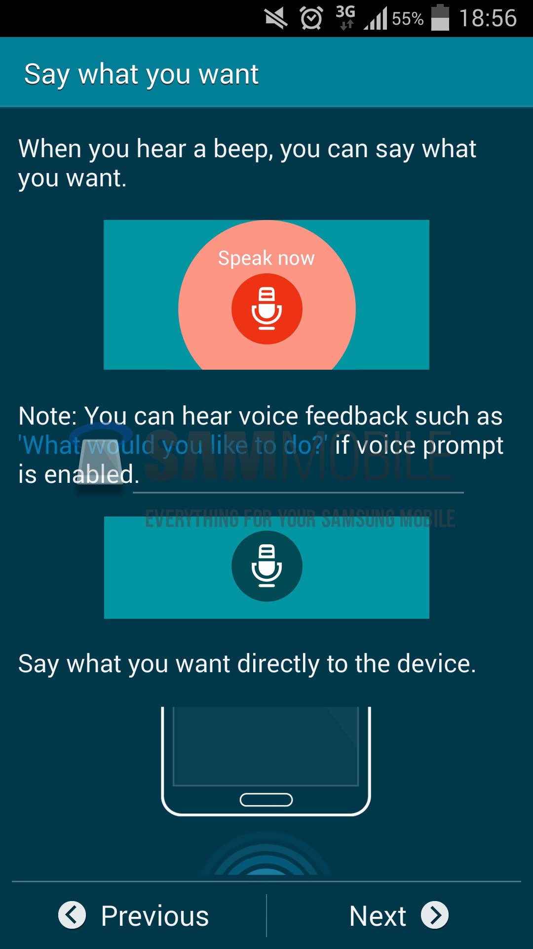
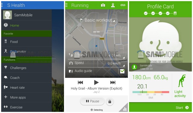
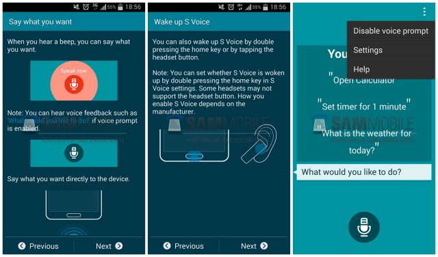
A mysterious Samsung device carrying the model number “SM-G900H” have some speculating that it could be the upcoming Samsung Galaxy S5 (or at least some kind of a variant). While we’re still not entirely sure which Samsung device it could launch as, some screenshots of a few of the device’s updated Samsung apps were leaked — namely, S Health and more recently S Voice.
What we found particularly interesting from the screen grabs is a refreshed new app design, taking a much more minimal, “flat” approach to the previous versions’ skeuomorphism. It’s not too apparent in S Health, but a heap ton more obvious in S Voice. You’ll also notice S Voice giving us a quick peek at what might be the bottom of the Galaxy S5, carrying a wider look and possibly smaller bezels (but the same ‘ol home button).
We’re wondering if this is the design change might have had something to do with Google’s recent visit to Samsung to talk about Sammy’s run away train that is TouchWiz. If this is a hint at what we can expect from the S5’s new version of TouchWiz — which we may have gotten a glimpse at in previous leaks — Samsung just might be onto something here. We’ll keep our fingers crossed.
Shouldn’t be too much longer before we find out what Samsung has been up to. The OEM’s “Unpacked 5” event is currently scheduled for February 24th, and although the Galaxy S5 wasn’t specifically mentioned in the invite, we have a good idea what they’re hinting at.



that statusbar looks too busy… thats one of my petpeeves
Technically it’s no different than stock Android except for the larger font. You can disable the battery percentage, alarm, and take the phone off of silence to clean it up.
Is there anyway to check the resolution of the screenshots? I’m assuming that would be pretty hard to do but…
They’re all 1080×1920.
wow that is ugly as hell
Hopefully the S5 gets rid of the dedicated menu button like they did on the Galaxy Note Pro’s…the screenshot shows an overflow menu button.
It will. All devices that run on Android 4.4 out of the box will have the recent apps key (at least on Samsung devices, since they’re following Google’s guidelines pretty nicely for KitKat, if only because Google made them a bit more necessary this time.)
i find the menu button pretty useful lol
What does this to do with the M8??
Um… wut? O_o
Chavez I know “The Man” has forced u to write this article, but deep down you really yearn for HTC M8 news.
:P
LOL
Damn you Samsung and the home button!
are you stupid? the home button is nice.
Don’t call me stupid. I am entitled to my own Opinion.
The Home Button maybe nice for people like you. I bet you have a White Phone with Hello Kitty stickers too??
Whoever is leaking these screenshots loves Magna Carter Holy Grail or album drops in all leaked material was part of their deal.
back in the summer, samsung was offering the album for free to s4/note2 users.
I know. I have an S4. You aren’t forced to donwload it. My point was that there have been several leaked screenshots all playing MCHG.
I love Samsung products, specially the Note 3. However their last moves have really started to worry me about the direction Samsung is heading… I might be totally wrong, but all the leaked pics of the new Samsung UI are very uh… frustrating.
Why do you find it frustrating?
They are too minimalist and flat plus it resembles too much windows to me… also it goes too far away from stock android and I don’t think that’s the best approach… Of course, I can be totally wrong, when TouchWizz first came out I hated it… and then it became my software of choice (Samsung hardware really helped in here too)… so I hope I’m wrong but so far I’m just worried.
I like the minimalist/ flat myself. But I wouldnt go too far, as like all trends it will be dated when design flavors change.
someone ban this nutjob already
She was also giving BJ’s behind the 7-11 for 20 bucks a pop. There was a line all the way to Chilis on friday night.
Funny how you leave that part out.
kill yourself!!!
Hope touchwiz as a whole gets a flat look. Current UX looks too heavy!