Check out the new Moto X Forums!

It’s official, folks — the follow up to last year’s Moto X is here. Still simply called the “Moto X,” the 2014 device brings major upgrades in every facet of smartphone technology. Processor, display, battery, camera and more are all seeing significant bumps. We’ve also gotten early word on pricing, availability and a lot more.
Moto X (2014) Specs
Here’s a quick rundown of the specs:
- Android 4.4 KitKat
- Dimensions: 72.4mm by 140.8mm with a 3.8mm/9.9mm low and high on the curve
- Weight: 144 grams
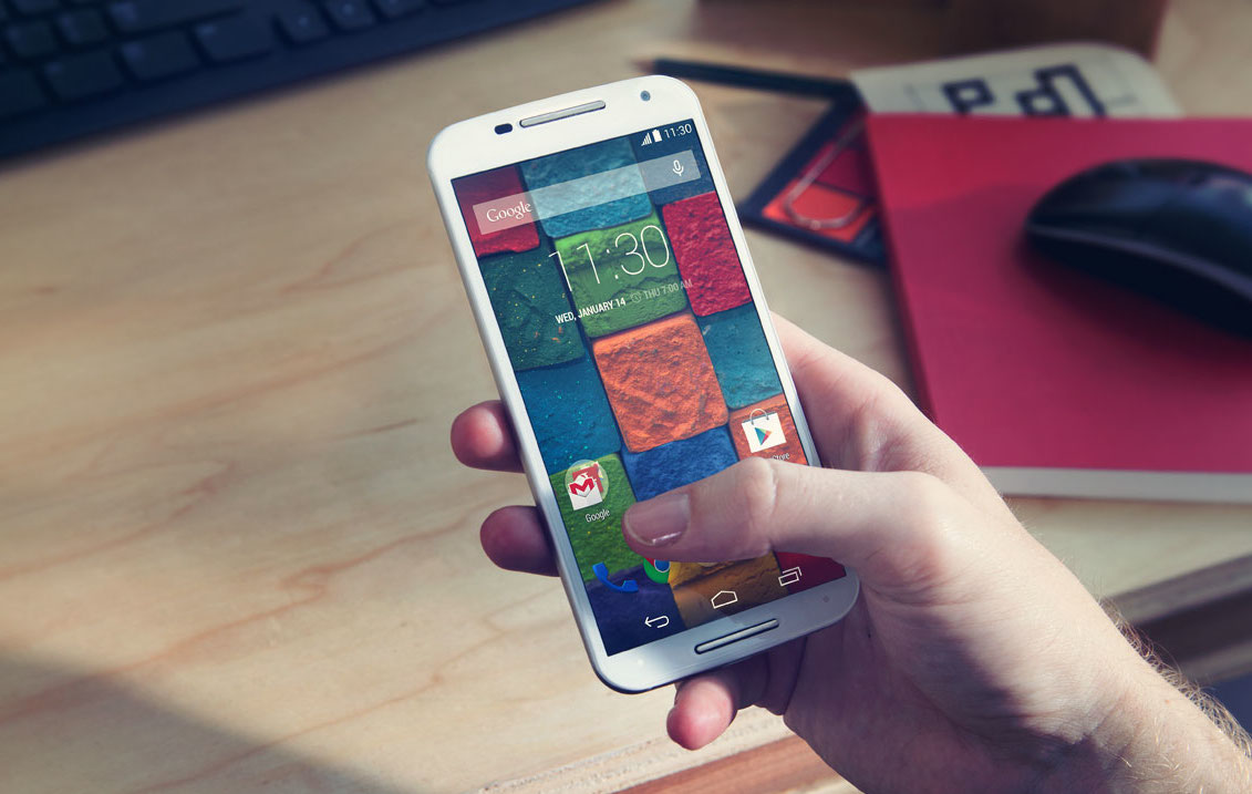
- 5.2-inch AMOLED 1080p Full HD Display
- 423 ppi
- Qualcomm Snapdragon 801 processor 2.5GHz quad-core CPU, Adreno 330 GPU
- 2GB RAM
- 13MP camera with Ring Flash and 4K video capture and 4X zoom
- Aluminum metal frame
- 3 all-new leather back options
- 2300 mAh battery
- Moto Actions (IR gestures)
- Turbo Charging
How’s that compare to the previous Moto X? It has a bigger screen yet, bigger camera, built with metal, adds several sensors, yet is thinner than the Moto X 2013. And it now allows you to alter “Okay, Google” voice activation with your own custom commands.
Motorola was criticized for using what people thought to be an underpowered chipset in the original Moto X despite it getting the job done well enough for everyday use. That said, they should have no qualms about the Snapdragon 801 that snuck inside this thing. The display’s 1080p resolution isn’t the 2560 x 1440 being featured in other flagship phones, but at a 5.2-inch form factor that’s still pretty nice pixel density there.
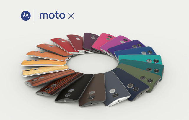
In terms of build, the new Moto X is made with a metal frame that stretches across the entire edge of the body. Metal is also used as accents for the power button, volume rocker, speaker grill and the rear-facing Moto logo. Coupled with some of the wooden (Bamboo, Teak, Walnut or Ebony) or leather backs (Natural, Cognac, Black and Navy from Horween Leather) that’ll be made available through Moto Maker it’ll all come together to make a really nice looking phone.
Moto X (2014) Software and Features
As you’d expect, Motorola again avoided the custom software route and instead embraced Android and Google’s apps as pretty organically. You’re getting a pretty clean version of Android 4.4, and you can expect the features Motorola added at the application level more than embedded deep within the firmware itself. This, of course, allows them to not only update the Android core at a ridiculous pace, but also the various apps and features they’ve cooked up.
Returning this year is hands-free voice control, except now you can customize the trigger to be whatever you want — something owners of the original Moto X have been begging for since the device’s launch. You could say “bing bang boom” and have it wake up and ready to act on whatever command you issue. Pretty neat stuff there.
Other big features making returns are Moto Assist for automatic actions (such as silencing a phone at bed time or replying to texts while driving), Active Display for viewing notifications without sucking up battery life (you can now view up to 3 instead of just the latest notification) and context-aware gestures like twisting your wrist to launch the camera app.
And because Moto believes less is more, well, there isn’t much else to talk about — they feel anything else you need is sitting right in the Google Play Store.
Moto X (2014) Pricing and Availability
Wondering when you can get your anxious little paws on it? Later this month, and you’ll be able to find it on carriers through Europe, North America, Latin America and Asia. Motorola anticipates some carriers pricing this thing as low as $99.99 depending on which model you get (16GB or 32GB), while the off contract pricing is expected to begin at $499.99. There’s no word on how much Moto Maker additions such as wooden or leather backs will cost, though we’re sure that information will come to light as we head closer to release.


Bring on the Droids!
Want level 80
In case anyone was wondering, the original Moto X sizes in at 65 x 129 x 10mm, the new Moto X is 72 x 141 x 9.9mm. While the phone is indeed thinner, no one will notice the .1 mm difference. Me personally, as long as the phone isn’t an inch thick, I don’t really care much about how super thin it is. I’d much rather the dimensions be cut from the length and/or width, so it can fit in my hand and pocket easier.
Lol the width is measured at the middle of the device, it arches around like the HTC one and lg g3,so it might actually be a lot thinner around the edges
Yeah, it does, just like the original Moto X. It is thinner around the edges, but that has no appeal to me.
I think the back looks OK especially with those wood and leather materials but the front looks atrocious, I’m all for front facing dual speakers but nobody has been able to pull it off with out making the device look super ugly with thick bezels.
The m7 and m8 look nice IMO. The only reason people hate on the m8 bezels is the software keys. If they had keys like the m7, I doubt that there would be this much hate for the bezels.
I hate the logo bezel because it makes the phone unnecessarily tall. It would been smaller than the Droid MAXX without that unnecessary bezel.
As soon as saw it was wider than my N5, I ruled it out. The pathetic battery is just the final nail in the coffin.
Looks like I’ll be giving the 4.7″ iPhone 6 some serious consideration.
just wanted to heAR yourself say that huh? thats what is pathetic.
No, I want to hear the justification Motorola have for making a phone that’s way wider than the last one, after they trumpeted all the extensive research they’d done to arrive at the original Moto X being the “perfect size”.
They were right that the original phone was about as big as many people want, which is why I held out hope they wouldn’t be entering the phablet wars with yet another two handed device.
how can people go from android to apple and back again. i cant it would be waisting money i buy alot of apps, cant put apps from apple on droid nd vice versa .you people are just silly how i hear you talk.As bout the battery ,man it charges like an oppo ,80% in 15 mins battery is no issue,and by now everyone should have a battery bank, if you love phones so much.
Hopefully there will be a mini version in the future with close to similar specs. IPhone is out of the question for me, but so is this new X. I’ll buy another 2013 X before I buy this thing.
I’m guessing I won’t be able to stuff one of SanDisk’s new 128gb micro sdxc cards in this thing, in which case I’m sadly going to pass. A shame, I really like where Moto is going with this line of devices.
How much ram is offered? ? *it was left out from the specs above*
2 GB. No improvement.
Which is enough! Really enough!
The Moto X’s new slogan: Our flagship device is really enough!
2300mAh battery? I was really hoping for something a bit bigger than I have in my N5 :-/
I agree. The weak, non-replaceable battery is the only thing killing this for me. Now that the last of the flagships has sailed in, I’ll probably just go with the GS5.
I’ll just wait a few more weeks for the N6. If that’s got a battery size north of 2700 mAh then I’ll just go with that. Judging by Google’s track record though, my hopes aren’t that high…
I love my SD slots, though…
That battery… shakes head. How can ANYONE in Motorola think that a 2300Mah battery is enough when they’ve increased the screen size.
That and the fact it’s physically larger than my N5 means it’s NO SALE!
How long has the battery lasted in your testing of it? Or are you just a clueless ass?
Unless they’ve made some incredible breakthrough in physics since they released the last Moto X update, the battery life will be poor to middling. Software optimisation can only do so much.
Should have made the screen a tad smaller and upped the battery.
Perhaps they’re banking on the improved battery management of Android L.
all i know is i want.
Why did they name it the same as the last version? All that does is confuse people or make the name longer (2014). It could have been Moto X2 just fine.
The battery concerns me. The HTC One M8 has the same processor but 2600mAh, and people are complaining about the battery life. Really, I would love a thicker phone if it added more battery.
M8 has best battery life of any phone I’ve used. If anyone is having battery issues with it they need to check what draining the battery because it out performs the S5 & G3. I currently have the G3 for almost 2 weeks now (still have my M8 in a drawer just in case I change my mind)
i havent heard anyone complain about the m8 battery, its at the top of the charts.
starting at $500?
FAIL….
how is that a “fail”?
not fail, but with the nexus 5 having mostly the same specs and being cheaper, you would probably be better off with nexus 5 or waiting 2 months for the nexus 6.
Great looking phone. What’s that? No MicroSD? Buh-bye.
4.7″ was perfect. 5.2″? Not interested in a phablet. Goodbye Moto X.
Grow a pair… then maybe u can handle a 5.2in device…
Usually I make fun of you for always always always being the hobbit who complains about “big” phones, but just this one time I’ll agree with you. :)
You see – my wife has teeny tiny hobbit hands and pockets too, so she recently settled on a OG Moto X (for $210) mostly because it was the smallest phone on display at Costco. She’ll probably never want anything bigger, including the new Moto X.
LMAO…”Hobit” ><
Just as Moto vacate the 4.7″ space, Apple are set to move in.
I was convinced this would have an sd card slot. Now it’s a no go. I really love AMOLED screens, but I’m really tired of everything else about Samsung phones. The moto x was the solution. I have loved it, but I’m constantly cursing the lack of SD card slot (I take a lot of video of my kids). Galaxy S5 here I come :( Hopefully I can get it de-Samsunged.
While I do praise the top notch hardware of the Moto X ’14, and the fact they are still keeping the moto maker service, I cannot help to think that the jump from 4.7 to 5.2 is too much. They should have went for 5.0.
why? It would still be a noticeable upgrade, while still leaving room for improvement for the next iteration.
Let’s not forget that one of the key buying points of the original was in fact the smaller size to accomoadate one hand use…which now many Manufacturers are focusing on as well.
I like that the “always listening” command can be changed. I like the larger screen. The more base OS may be great to integrate with upcoming android auto. And there’s the old phone buy deal. Time to trade up from my old samy S3, this looks best for my needs so far.