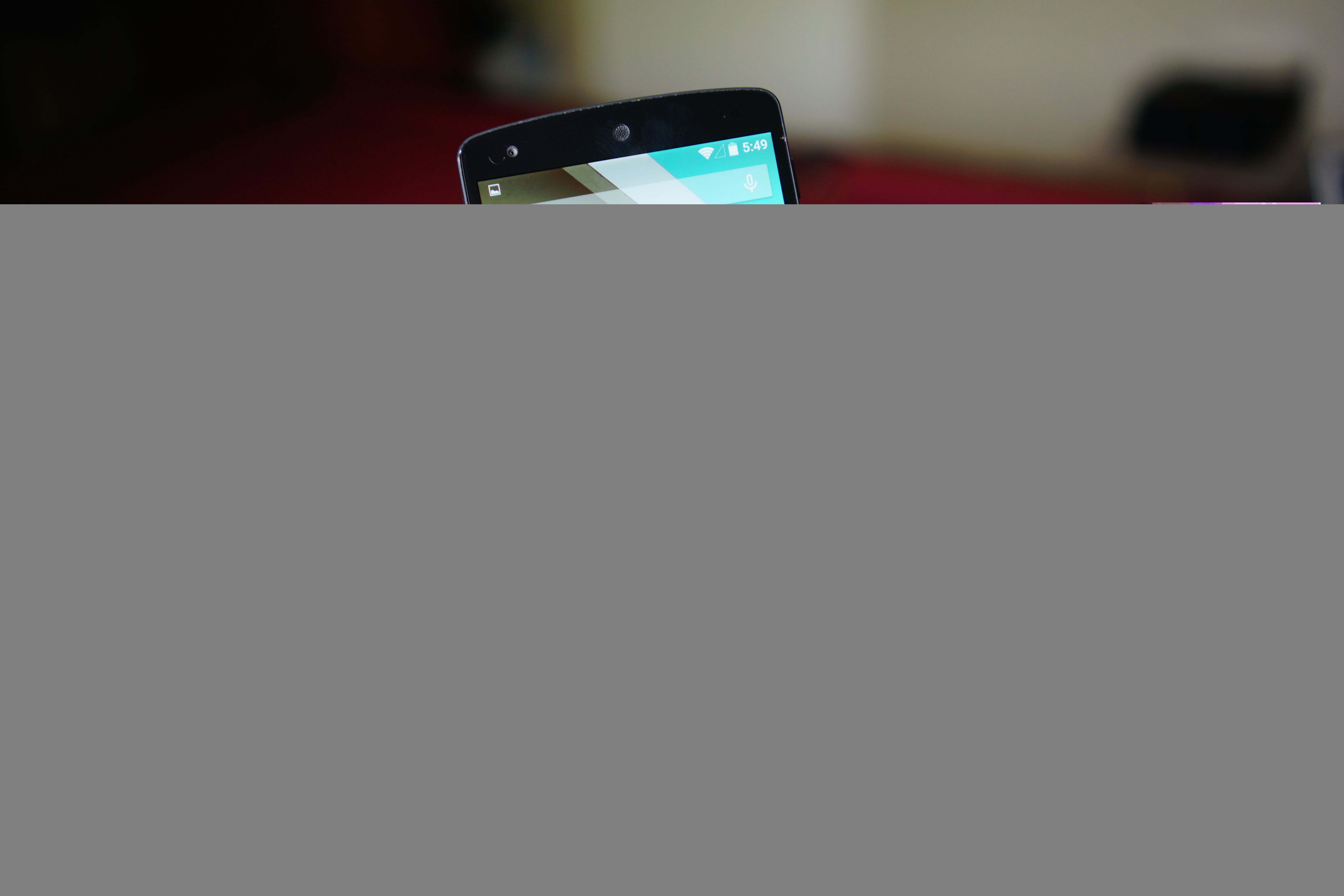
Android L might not look totally different when it makes its way out of the oven compared to what Google first showed at this past year’s I/O, but Google isn’t against changing a few things up ahead of its official release. A video from a recent Chromium report on a fairly recent build of Android L — build LRW87D — shows that the team has tweaked the looks of the status bar and navigation buttons.
The changes aren’t massive, though they do present enough of a difference to make us notice. Icons in the status bar for things like WiFi and battery level are now solid shapes instead of being broken up by thin lines. It should still be easy enough to tell how strong a signal is or how much battery you have left as the icons degrade so folks shouldn’t have too many qualms with that.
As for the navigation buttons, they have shrunken in size, become a bit brighter and the lines have thickened up a tad. Again, it’s a subtle change from current Android L builds but it makes the user interface look a lot more mature and tight than it originally did.
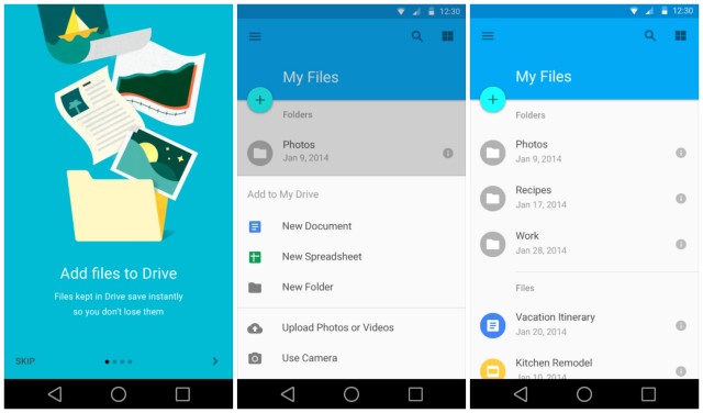
I especially like the change to the navigation buttons as I felt the previous design felt a bit too toyish. These tweaks make a world of difference to me despite them being the exact same shapes and designs. You can see the original Android L interface below so feel free to compare it to the changes seen in the screen grab above.
Of course, you may feel differently about all of it — you might have preferred the original Android L icons all along, or you may think this change is a step down. Let us know how you feel about the differences in the comments section below as we await the arrival of what should turn out to be a delectable treat. The quick video from the Chromium issue tracker is sitting below if you’re interested.
[via MYCE]


Hopefully this build renamed the OkHttp and Okio packages.
Having those included with the system causes my apps to crash on Android L and I’m tired of repacking them as a hacky workaround. :/
Not sure if i like the change in wifi and signal icons. I can hear support now. How many bars of signal do you have? 1 bar but it’s kind of cut in half, quarter? I can’t tell. :P
Or you could just go to phone status in settings since it gives you a real reading on your signal.
Still not thrilled about the new pop-up notifications in Android L
Really? I think they’ll be very convenient.
Really. I don’t want a non-user-driven event to invoke an obtrusive UI element on my screen. Especially if I’m trying to read content on a website, or watching a video… the pop up notification as a UX method was put to bed with the advent of the notification pane first in android and then in iOS. Now it looks like its back en vogue.
I’m pretty sad that we’ve somehow come full circle and now are embracing huge white squares flying across the screen when we get a message – forcing the user to interact with it to make it go away.
Well it’s android so perhaps you’ll be able to turn the pop up notifications off. I think if it implementation is anything like Apple’s it shouldn’t be very intrusive at all but to each his own.
I think you’re missing the point on this. Previously, a phone call would stop everything and take up the full screen. In L, it will have a pop-up at the top, but let you remain in the app you are currently in. So, if anything, this is LESS obtrusive.
yea you are really trippin. the guys underneath me made it clear. You will most likely be able to turn it on and off and more importantly the phone call screen took you all the way away from what you were reading. now itll just drop from the top and stay out of your way. I love it. especially on the lockscreen
1. I wish they kept the current navigation button.
2. I also wish the navigation buttons where crop out when somebody screenshot.
Will we be able to change the navigation buttons?
I will root and change them if I have to. No reason for that confusing change, that’s just going to confuse new Android users coming from iPhone and whatnot.
how exactly will it be confusing for anyone android or iphone?
Because if you’ve never picked up an android device how would you know what the keys were for? At least the existing ones offer clues of what their function is.
Personally the only one I would think would confuse people at first is the “recents” button. A square could mean a lot of things. But a lot of people associate a left pointing arrow (or triangle) with “back” and the centralize circle can easily represent “home” even for new users. Hell the new home icon might even be more familiar for iPhone switchers as they’re used to a circular physical home button. There will be a little confusion from some people sure, but I don’t think it’ll be any more confusing than getting used to the learning curve of android in the first place.
Yeah I agree, people will figure it out, I just don’t see why they feel the need to change something that isn’t broken. Sure, they could add a key or take away a key, and that could maybe be seen as some kind of improvement, but changing the shapes without changing the function does nothing to improve anything.
Second that. The old symbols were actually telling some kind of story and you could have a clue at least. Now you would not even guess what the recents button is before you’ve learned that it’s the recents.
I agree with you for the back and home buttons, but to be honest I didn’t think the previous recent app button did any better of a job than the square does. To look at it, it kinda looks like some sort of picture in picture button or something to do with UI layers. In the defense of the android dev team, it’s kinda hard to boil down “this button, when pressed will show you all the apps you’ve been using recently” into a simple icon.
In regards to the topic of our discussion I think the home button will see the most significant impact. The house shape from before was easily identifiable and it was pretty obvious as to what it’s primary function was. The circle however is much less obvious (though it may actually feel more familiar for folks coming from iOS) and will likely confuse many new users at first.
Personally I think they should make the appearance optional. Perhaps offer the more obvious ICS/kitkat style buttons by default so that there’s less confusion, and then allow users to select the new buttons if the wish for a more unified look. Or at least have a tutorial for new users.
I don’t think the old symbol is confusing at all. Pretty similar to windows stacked on top of each other, imo giving the user a hint of multitasking or some kind of overview. I’m with you on the other part though
It doesn’t improve anything in function no, but it does improve in form. The change helps to unify the appearance of the UI and makes the navigation panel feel much more like a part of the material design language rather than just a utility that has been dragged along since the Honeycomb days. I agree that visual upgrades aren’t needed nearly as often as performance optimization and functionality modifications, but they are necessary at times and when implemented they need to be as thorough as possible, otherwise it just makes things appear half complete or fragmented.
How about common sense….. Or how about trial and error. I’m laughing out loud at you. All anyone has to do is press the button once and you know its function. How did anyone know what the home button did on the first iPhone? Cmon now
Glad i could make you laugh. How about you keep laughing at me, and I’ll keep laughing at the fact you think new shapes for buttons is any kind of improvement.
Who said it was an improvement. In fact I don’t have a problem with anyone who says it’s ugly. But a problem ? Cmon now. I see pre school kids play with phones and tablets and do you think they know exactly what the buttons or shapes on current phones are ? Nope but what they do know is if they push the middle one it’ll take em to the main screen. Go ahead and complain about how ugly it is but don’t say its gonna be an issue or problem or confusing
They need to make that black bar of death at the bottom a lot thinner.
The buttons are fine and could totally make sense, it’s been cryptic on computers forever, but you just learn:
Macs are weird.
True, but I don’t think that Windows has ever changed its buttons, but maybe that’s why their sales are decreasing. They need new buttons to confuse people and get them talking.
Personally I don’t understand why android keeps going through these blessid UI changes… There are other bugs and issues and ways the system works that are just puzzling and really out intuitive. I wonder why they keep putting effort into things that don’t need changing. The only thing I would’ve changed about the navigation bar is: make it transparent. End of rant, but I still can’t get my head around why…
Not*