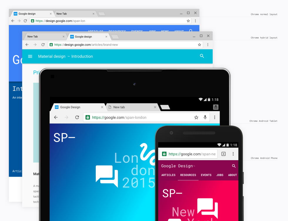
Chrome 50 is a big milestone for Google’s popular browser. They’re celebrating with a bevy of new features. The biggest changes will be seen in Chrome OS, which will get a brand new Material Design look. The general UI of Chrome won’t change, but it will look a little different.
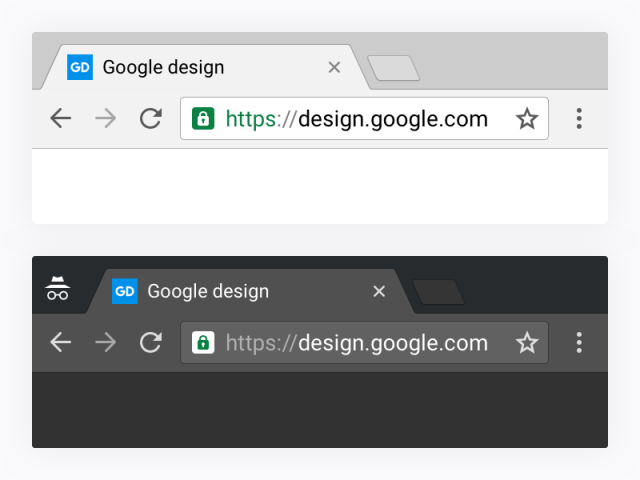
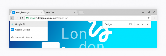
If you’ve used Material Design before, this new look will be familiar to you. Everything is much flatter. No more gradients and shadows. The menu button is now the three-dot icon from Android. Folders have a new look and the fonts have been cleaned up a bit. Overall, it’s just a nice subtle update to the interface.
Google says the new design is rendered “fully programmatically,” which means it doesn’t have to load the 1,200 images file for UI anymore. The move will also allow Chrome to support more screen resolutions. These changes are rolling out now to Chrome OS, but you can try it now on PC and Mac by downloading the Canary build, typing “Chrome://flags” into the address bar, and turning on the “Material Design in the browser’s top chrome” option.
[via Ars]






Comments