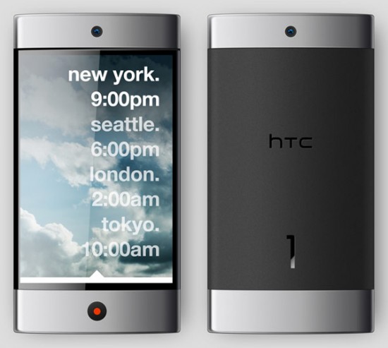
I’m not usually one to get too excited about concepts drawn up by third parties showcasing devices that will most likely never even cross the desk of the design team of any manufacturer, but the following personal design project for the next generation of HTC handsets is actually kind of neat for several reasons. Not only does it re-imagine HTC’s current look and feel that seems to make all of their phones look like a smaller/wider/stretched/etc. version of previous devices to give the high-end concept some individuality, but it also recreates HTC Sense to create unity between the device and software. Perhaps a slightly bizarre addition is a self-cleaning UV light that kills off microorganisms as the phone charges. I bet you weren’t thinking of your phone as a disgusting harbor for germs and bacteria before now, were you? See the full concept at Design Fabulous.
[via Engadget]





What’s really gross to think about is when you put your phone face-down to hear the speakerphone… oh all that nasty stuff gets into the earpiece.
Gross… but I do it anyways.
kinda cool concept.
sounds carcinogenic.
You know, the first time I saw this thing, my reaction was “wow–I’d buy that tomorrow”. The more I look at it though, the more the love affair ends. It isn’t that it looks classy and up to date, but that it’s simple. Simplicity is a very hard thing to do right. This, while simple, lacks *elegance*. It sorta reminds me of a cigarette lighter lava-lamp sort of design. Functional, but base and cheap. I think that a little bit more selective rounding of the lines might go a ways to helping it. The re-imagined Sense does look cool. I’m just not in love with the hardware. But then, I’m not a designer. :)
Hopefully htc won’t use a generic driver for the uv cleaning system…
nice concept, except where’s the camera? I see an ear piece on the front and an external speaker on the back. At least i guess that’s what they are, but no camera.. How high end is that?
Looks awesome. Want, preferably with an XGA or higher screen resolution and Android 4.3 :P
Hopefully htc won’t use a generic driver for the uv cleaning system…
–
–
“I know I’ve made some very poor decisions recently, but I can give you my complete assurance that my work will be back to normal. I’ve still got the greatest enthusiasm and confidence in the mission. And I want to help you. “
“nice concept, except where’s the camera?”
–
That’s the problem with nice looking concepts: they can’t adapt. In 6 months they will be outdated by phones that put more into better specs than looks.
I suspect the camera is the blue dot (on front and back). The “earpiece” appears to be speakers that are either at the ends of the phone or inside the phone (see “Hidden speaker”) — that doesn’t sound like a great idea, but seems to have been done for aesthetics.
@ari-free: “That’s the problem with nice looking concepts: they can’t adapt. In 6 months they will be outdated by phones that put more into better specs than looks.”
—-
It seems to me that that would be the problem with both nice looking and ugly looking concepts. As long as it looks nice and is built to current specs, that’s the most you can hope for.
The only type of phone that wouldn’t be outdated is if they made modular phones, in which you could upgrade your camera, processor, or what have you as new technology arises. That seems unlikely (in the near future). Even then, it’s possible to create a “nice looking” modular design versus an “ugly” modular design.
Please someone tells HTC to hire him…
Hardware looks great, but the iPhone looking apps need to go. It also looks like they took a few pages from Tokyo Flash when it comes to design concepts, which isn’t necessarily a bad thing.
I’m talking from the OEM’s perspective. It is easier for them to keep up with the latest tech if they didn’t have to worry if the screen is curved.
One more thing, I would love a phone with a flat back so I can use the interface when I’m playing a game or using apps, it will be easier to use the touch screen. Flat phones don’t feel as good when held so it’s always lost in the tradeoff.
“It also looks like they took a few pages from Tokyo Flash when it comes to design concepts, which isn’t necessarily a bad thing.”
–
See, I prefer to have a watch that actually tells you what time it is.
It looks like a soulless corporate device to me. I just have to look down at the ancient gray and black Dell I’m typing on to see the “inspiration” for this device. It totally looks designed for middle management – gray suit, gray computer, gray phone… gray personality.
As far as the other stuff
– stand. Looks kind of neat but could break/come open during conversation. Gives the phone an odd lack of symmetry when open. For me, outside of a keyboard, the fewer moving parts the better. If you do have a built in stand, put it in the back and make it a piece of removable plastic so that when it breaks I can decide whether to replace the stand or just chuck it and live without.
– two speakers = pointless. When I use speakerphone, I’m not worried about stereo. When I listen to music, I’ll want more fidelity than those tinny, tiny speakers will provide. Plus how good of sound will hidden speakers give? And if I want to set the phone down and listen to music, what does the speaker in the stand sound like? Different?
– widgets/UI skin = very washed out/gray. Fitting for the corporate styling of the phone; polished but a bit boring.
– self cleaning. It looks cool, but I’m not really a germophobe. I’m clean, like things clean, but I’ve lived 30+ years without a self cleaning phone – does it really provide a health benefit? Especially for a phone I’m likely the only user of? Still, its a neat idea and maybe I could be sold on it.
– shape – slightly rounded candy bar. Not as rounded as iPod nano, but not flat like other phones. Would probably feel comfortable to hold, may not be as nice setting down on a table.
Overall – looks very utilitarian – not a single superfluous line, button, or color for that matter. I wouldn’t hate owning this phone, but I certainly wouldn’t be showing off its cool styling – sort of like my Dell laptop.
This phone is not even being considered by HTC its just someones concept of what a HTC phone should be there is no want, there is only never ever, ever. Yes I understand that SUCKS!
reminds me of those dell phone leaks
wait a second…didn’t we see a french Android tablet that looked almost exactly like this?
http://www.slashgear.com/evigroup-wallet-android-mid-gets-new-design-status-update-0965585/?utm_source=feedburner&utm_medium=feed&utm_campaign=Feed:%20slashgear%20%28SlashGear%29
Now, here’s a new concept: Use a phone as an odor-remover/cleaner and deodorant :) That will make billions :P (it would save people so much time..taking showers, etc).
This looks too much like an Iphone for my liking, even though it is pretty pretty (lol).
also, I have been trying to make a hard choice. Should I buy an HTC Desire rite now or wait an see what comes out in an year and just buy my friend’s Iphone 3g for 50-70$. Do u think that if I bought a Desire rite now I would regret not having waited when next year comes?
If only. It amazes me that manufacturers cant come up with something like this.
It looks nice and all. However, looking at the way it sits in the hand it looks about the size of an TouchPro2. That would mean a smaller screen and we know that’s not the industry direction. The direction is towards larger screens to view more content. This is a nice phone, but not quite as interesting if it’s meant for mobile computing. It would be interesting if the same guy took a shot at larger screen concept.
Here’s my dream phone computer:
1) 5 row offset keyboard (not a grid)
2) trackball
3) an SD slot that’s as easy to use as a CD drive (not under the battery). On my old Sony TG-50 Clie I could just pop in a memory stick from the top
4) at least 4″ screen
5) ffc and good rear camera with flash
i just don’t see how all these features could ‘fit’ with this ultra simplistic design
keep dreaming ari-free, thats alot to ask for, unless you want your phone looking like a swiss army knife? lol
nice concept though
Phone while looks very nice an elegant also looks a little too plain.
One concern I would have about this design is the twisting base stand. I would have concerns of it eventually snapping or becoming loose over time.
One thing that I really really miss that all the smartphoones have removed over the past years?
An IR transmitter. I really miss being able to use my smartphone as a universal remote. I would like to see this return.
also not a fan of what looks to be a non removable battery.
The concealed speaker design while it makes the device more streamlined makes me sceptical of the units sound quality/volume level. Tho I’m glad it isn’t a single mono speaker design.
Not a big fan of the sense redesign either.
Also, this design will not work if the OS were to be Android.
It is sorely lacking in the front face buttons (whether touch sensitive or physical) that Google set as a requirement for the Android OS.
Sense OS needs a serious reworking the artist concept is not good enough either, Sense OS was fine for the HTC HERO and ERIS but for the EVO? it looks hideous come on HTC change or get left in the dust P.S. Droid interface sucks even more but all are far better the IOS4….
This kinda looks like a Windows Phone 7 based on looking at the screen.