It’s been a few days since Google dropped the first developer preview for Android 12, and that’s given everyone a chance to get their feet wet. The general consensus seems to be that this could end up being one of the biggest updates to Android ever, even if there aren’t any major and radical changes being made.
How to install Android 12 Developer Preview
If you’re wondering what you could find when Android 12 drops later this year, we’ve rounded up just about all of the “major” changes. There’s a lot to cover here, so let’s dive in!
Semi-transparency, everywhere
For one reason or another, it seems Google’s gearing up to release one of the largest overhauls for how Android looks and feels. This isn’t as large of an update as Material Design, but as soon as the Android 12 preview is installed, you can begin seeing the changes.
Lock Screen Changes
For better or worse, not much has changed with Android’s lockscreen clock over the past few years. It’s possible that could be changing at some point with Android 12, as there is a new lockscreen notifications UI present in the first developer preview. As with many of the “cool and new” features, this is turned off by default, but would change around the layout. This includes a much larger digital clock, while the ‘At A Glance’ widget can be viewed in the top left corner.
Semi-transparent Notification Shade
In years past, Android’s notification shade offered either White or Black backgrounds whenever viewing your notifications or Quick Settings. Now, that’s changed to a semi-transparent background, with bluish tints to be found, depending on your system theme.
New Theming tools
Another feature that is found in Android 12 but is not yet activated for end-users is the wallpaper-based theming system. When enabled, your Pixel will select the primary color of the wallpaper that you are using, and then show the color throughout the interface. This includes adding some color to the Settings app, along with using that color as the accent for your Quick Settings toggles.
Snooze button for notifications
With Android 11, Google introduced a way for you to snooze notifications, but it required too many steps. You would have to swipe over, then tap the Snooze icon, and select the duration. But the problem was that you could accidentally swipe too far and dismiss the notification altogether. Android 12 adds an all-new snooze button, making it far easy to snooze notifications without accidentally getting rid of them.
Expand or collapse your notifications
Android 12 adds the ability to expand/collapse notifications by tapping the app icon on the left in addition to the already existing arrow on the right.
Small detail, but really nice one! 💯 pic.twitter.com/W77NOTGY77
— Dylan Roussel (@evowizz) February 19, 2021
In addition to the new Snooze button, there’s a new way to expand or collapse your notifications. Instead of trying to press the tiny arrow on the right-side of your notification, you can now just tap the app icon to read more of the notification, or tap it again to collapse it.
Silky Home
There are some changes being made to the Settings app, but this is nothing compared to what we could see in future developer previews. Silky Home offers a design overhaul of the interface, and most notably, the Settings app. This is a feature that must be activated over ADB, and when performed, will push all of the content further down the page.
Silky home adds more space in-between options, providing much better usability for those using just one-hand. It’s not a surprising move, but one that looks like Google is aiming to bring Samsung’s One UI 3.0 interface to stock Android.
One-handed Mode
Here's Android 12's one-handed mode – fully working. Sadly, it's like Apple's Reachability (vertically downsizing) rather than OHM on most OEM software (both horizontal and vertical downsizing). pic.twitter.com/IznRVHTgPu
— Mishaal Rahman (@MishaalRahman) February 18, 2021
With phones continuing to get larger and more frustrating to use with one hand, Google is working on a dedicated One-handed Mode. However, it’s not going to be like Samsung’s, which shrinks the entire screen to one of the bottom corners. Instead, Android 12 is going to bring something similar to that of Apple’s iOS. When activated, the content will be moved down vertically, leaving an empty space at the top.
In its newfound effort to make Android 12 easier to use with one-hand, there’s an all new gesture available for viewing your notifications. Instead of performing the ever-frustrating finger gymnastics to reach the top of the screen and pull down notifications, you can swipe down from the bottom (near the navigation bar) and your notification shade will appear. This is available in any app, and isn’t just limited to the home screen.
Updated Screenshot Editor
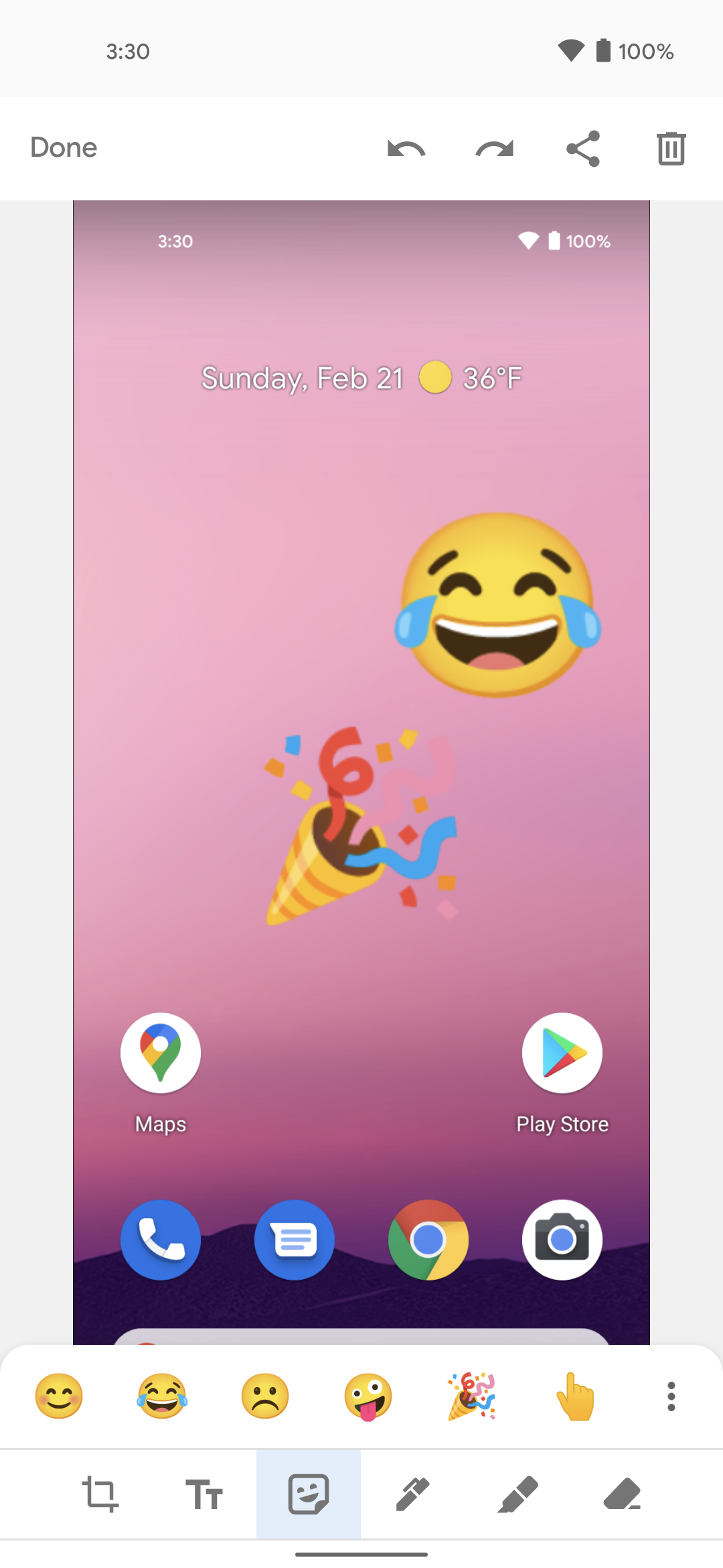
Android 12 introduces a few new ways to edit your screenshots and images before sending them off. The first of which makes it possible to add emojis alongside any other annotations that you make to the image.
Google is also making it possible to edit or annotate any image that you are sending via the Share Sheet. Previously, you would have to make your edits before sending off the image, but that seems to be changing with the next version of Android.
Scrolling screenshots
Scrolling screenshots are still a bit janky/broken, but it actually works! (It's not enabled by default so you won't see it when you update.) pic.twitter.com/7ih2zQgvZk
— Mishaal Rahman (@MishaalRahman) February 18, 2021
One feature that Pixel owners have been clamoring for has been Scrolling Screenshots. There was much excitement after this was seen as part of the Android 11 developer preview, but it was removed before the final release.
With Android 12, scrolling screenshots have returned, but it’s not enabled by default, so there’s no telling whether Google will be keeping it in. While other phone makers have already added this feature to the software, bringing it stock Android would add feature parity for even more devices, regardless of whether you have a Pixel or not.
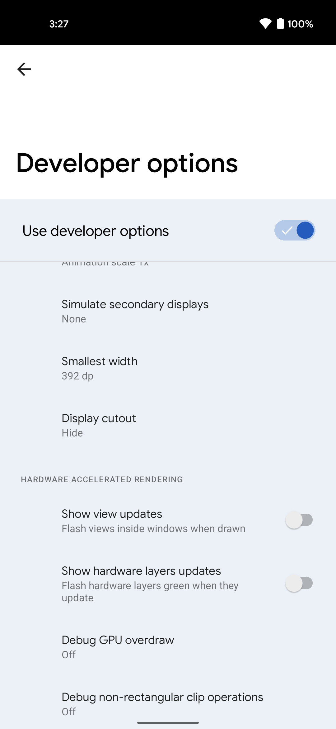
Hide the hole punch cut out
Ever since the hole-punch camera was introduced, smartphone makers have provided options for “hiding” the camera with a black background or moving the status bar. Google has added another option for the Pixel 5 which fills in the status bar entirely, so you can hide the selfie camera if it’s an annoyance.
Widget stacking
Android has had widgets forever, and when Apple introduced widgets to iOS last year, there really wasn’t much to write home about. However, it seems that Google likes the idea of how iOS handles multiple widgets being stacked together. XDA Developers’ Mishaal Rahman has discovered “enhanced” and “expanded” smart spaces. This is in extremely early development, so it’s entirely possible widget stacking on Android is saved for next year.
Additional Home Screen Grid Option
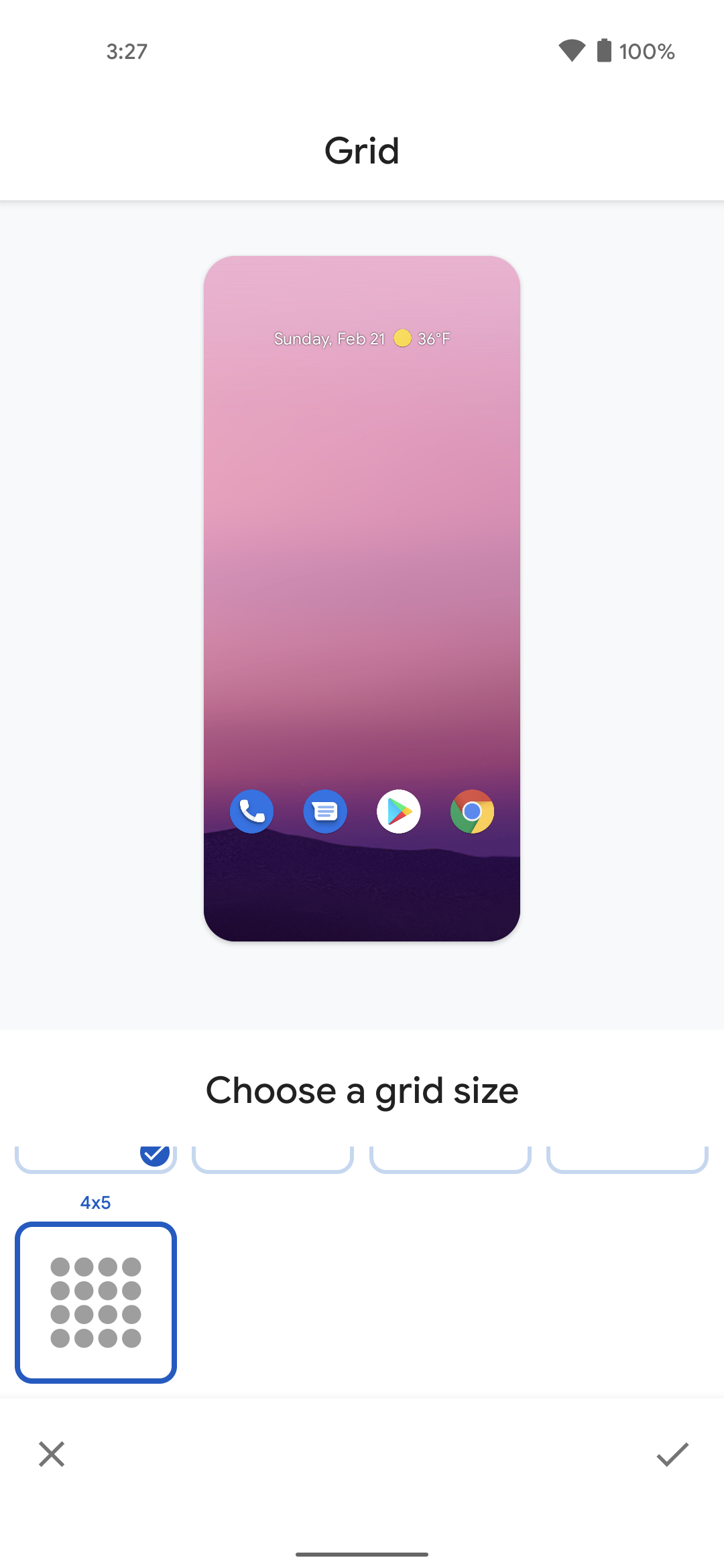
Being able to change up the way your home screen looks is one of the best features of Android. Google is adding another way to do so with the new 4×5 grid option for Pixel Launcher. It seems to not be available on every Pixel device, as those with the Pixel 3a are not provided with this option.
Block camera and microphone usage with a tap
Google is definitely ramping up privacy controls with Android, and there’s an experimental feature to make it easier to block usage. This feature not only adds pop-up warnings when the microphone and camera are being used, but also some new toggles in Quick Settings.
Pixel 5 ‘Double Tap’
What started as an Accessibility feature on iOS has turned into a shortcut feature that Google is attempting to bring to Android. On the iPhone, there’s a feature that can be enabled which will perform a multitude of tasks simply by tapping the back. These include things as simple as showing the notification shade, to running a Shortcut via the Shortcuts app.
Google is working on something similar in Android 12, but is currently only for Pixel 5 owners. When enabled, a double-tap will make use of your Pixel 5’s accelerometer and gyroscope to detect the gesture. The feature is enabled by default, but does not seem to be working as of yet. When the time comes, you’ll be able to select one of the five options:
- Open Assistant
- Take screenshot
- Play and pause media
- See recent apps
- Open notifications
Send Wi-Fi to others with Nearby Share
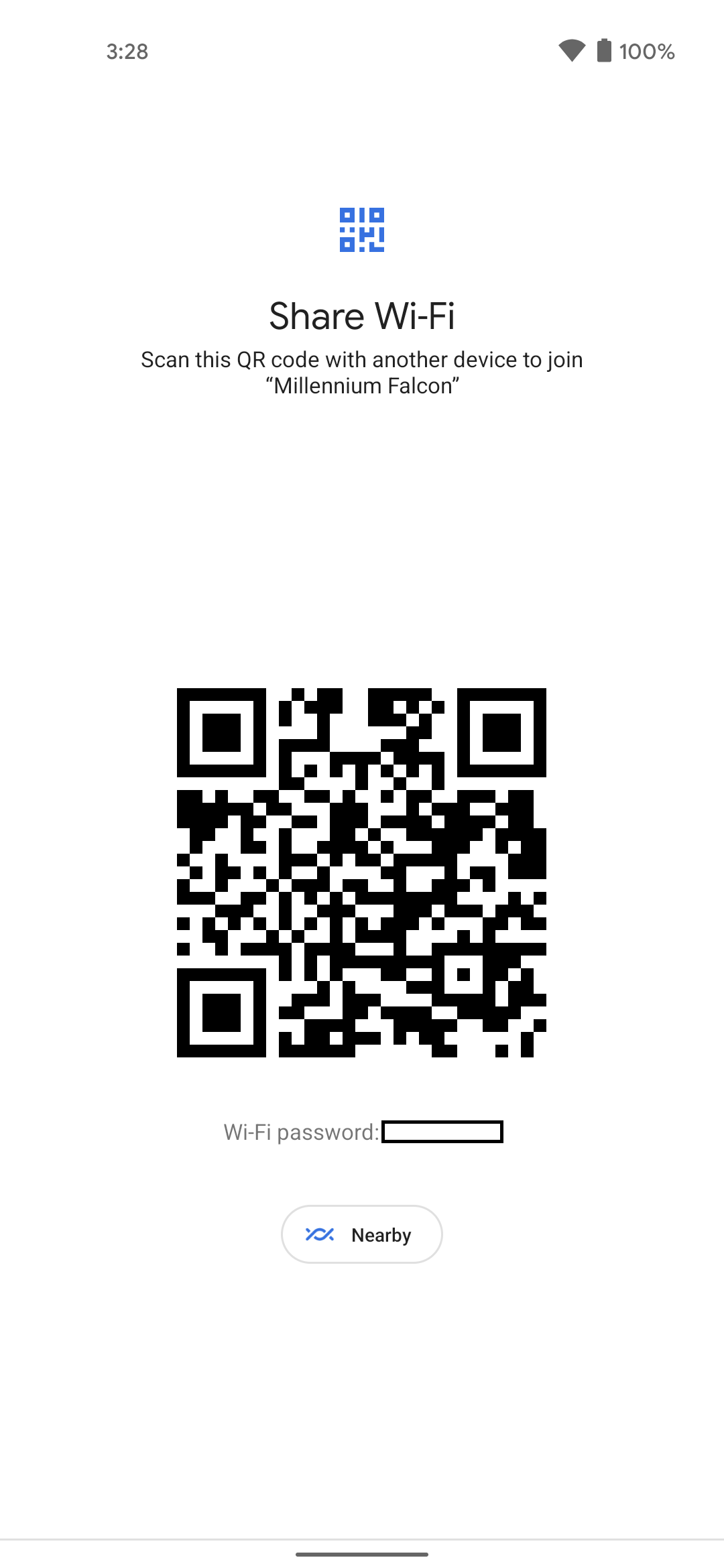
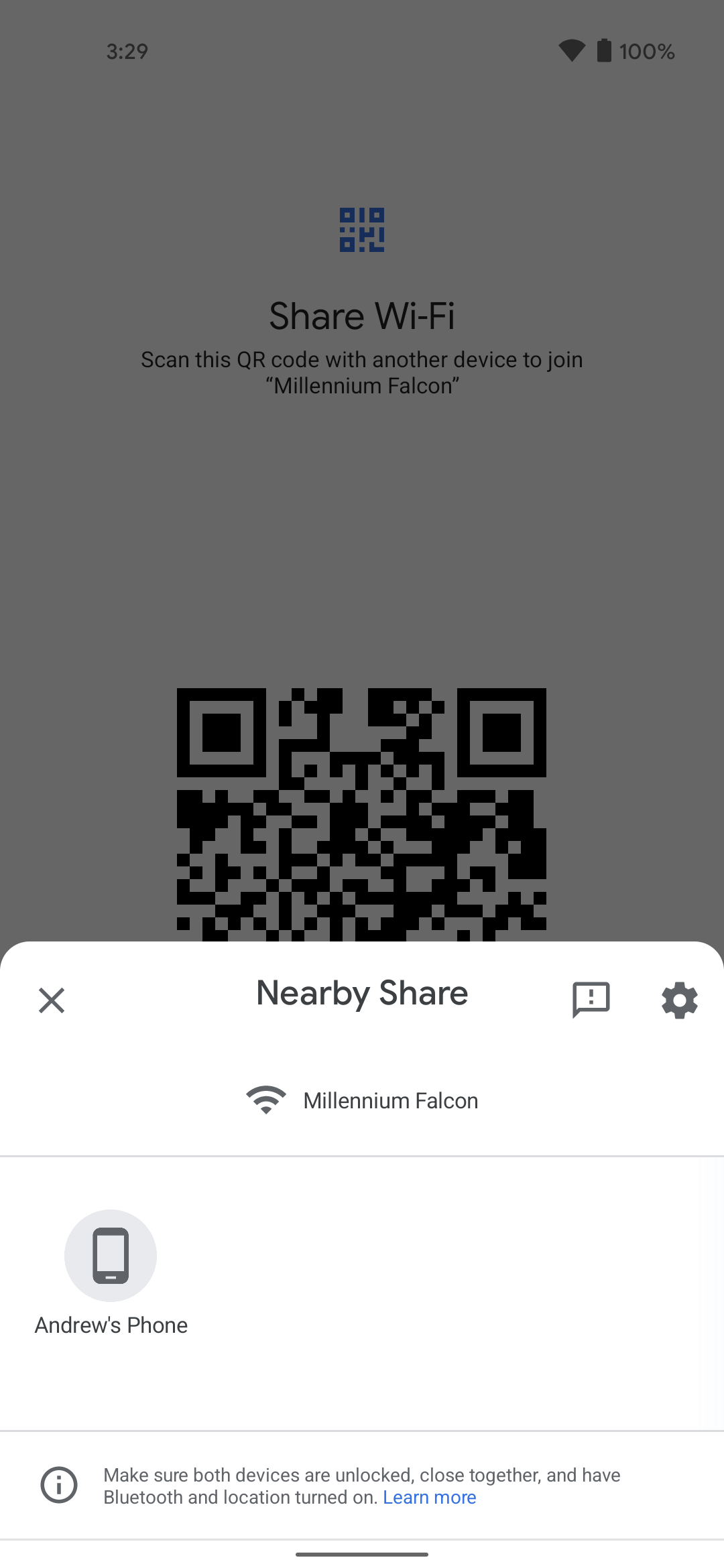
Sharing your WiFi password with others can be a pain, because it’s usually an array of letters, numbers, and/or symbols that has no real semblance. But Nearby Share allows you to share a WiFi network just by scanning a QR code that appears on the host phone. Or, you can tap a Nearby Share button and send it to a nearby phone
Change which apps appear in media controls
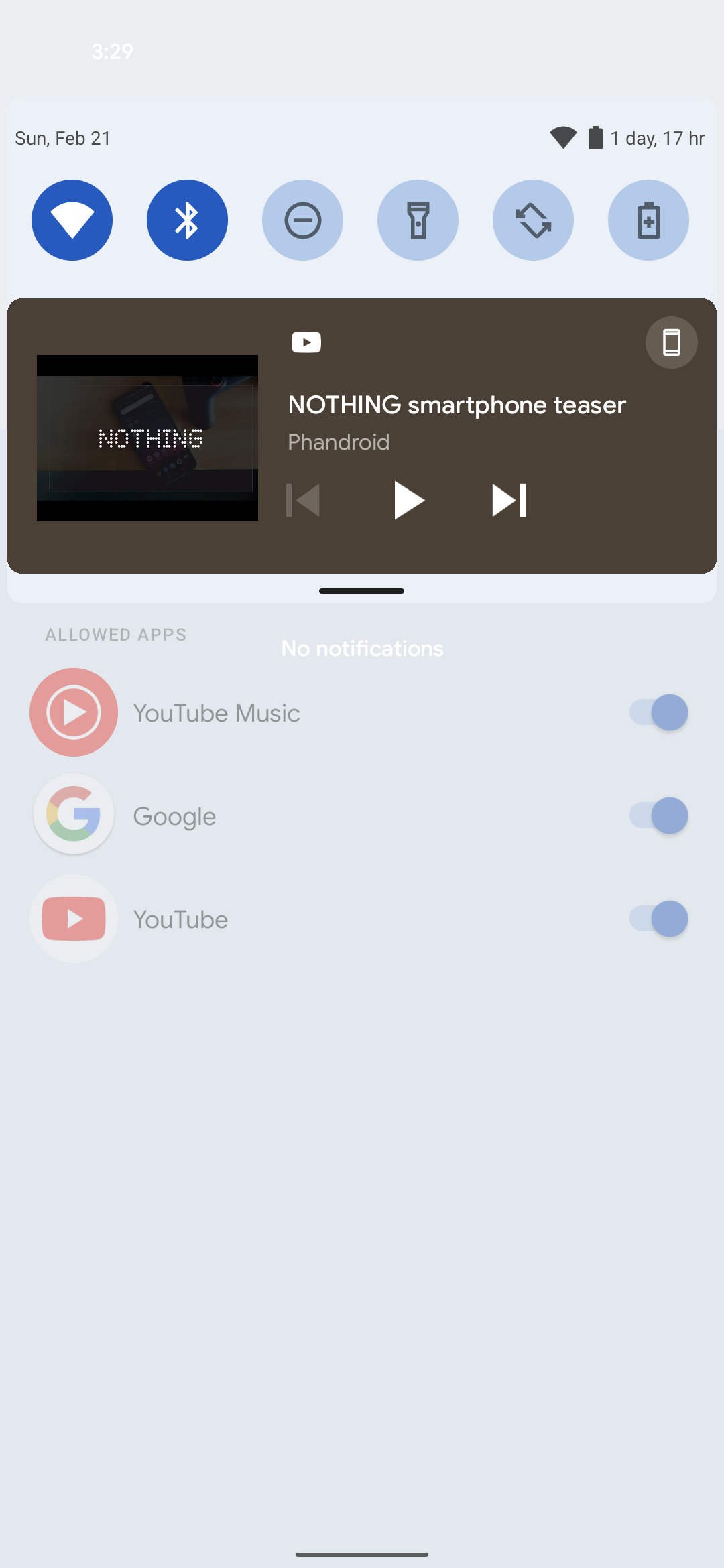
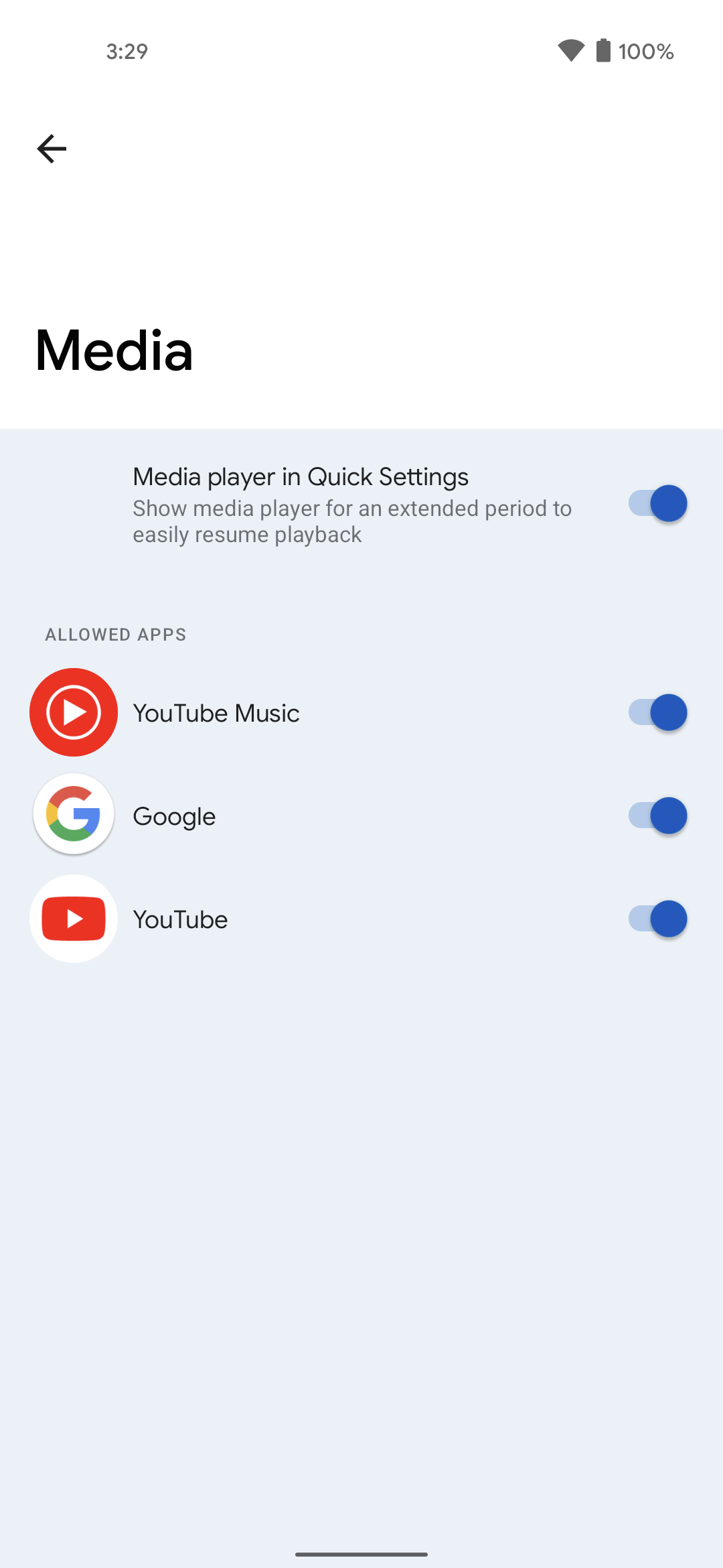
Android 11 introduced new media controls that appear in the notifications panel, making it easier to control your music or videos. You are able to swipe between apps that have recently played media, but with Android 12, you can choose which apps appear in this notification.
Improved navigation in full-screen apps
In previous iterations, you would have to swipe to reveal the navigation bar when using a full-screen app. Android 12 changes this, making it so that you can swipe just once to perform a gesture, even if you’re using a full-screen app. It may seem like something trivial, but the change makes it easy to pop out of an app if you need to, without having to perform multiple swipes.
What devices are compatible with Android 12 right now?
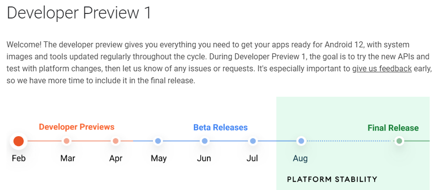
If you’re wanting to get your hands on Android 12 before the beta program begins around May, you can try it out. But as is the case with stock Android developer previews and beta releases, these are only available on select devices. Here are the devices that you can try out Android 12 on:
- Pixel 3 / XL
- Pixel 3a / XL
- Pixel 4 / XL
- Pixel 4a / 4a 5G
- Pixel 5
When will Android 12 be released?
Last year, Android 11 saw its first developer preview released in February, but the final version didn’t hit Pixel devices until early September. With Android 12, it seems that Google will be keeping a similar schedule, although we could see the first betas made available as early as May.
The reason for the time gap between the developer preview and the final release is for Google to get the software into the hands of developers. This makes it easier for bug fixes to be issued, along with additional features to be added or removed before the final version is released.
Then, it will be a while longer before the stable version of Android 12 makes its way to non-Pixel devices. Phone makers need time to make their own skins compatible with the new features, while implementing things that Google may not have. It’s very likely that your brand-new Galaxy S21 won’t see the update until early 2022.
Should you install Android 12?
You should avoid downloading any Developer Preview unless you are a developer. Even though there don’t seem to be many major feature additions, app compatibility is easily broken, and you could even end up with a phone that doesn’t work properly. It can be tempting to try out the latest and greatest software ahead of its final release, but bugs can be nasty and you could lose important data on your phone.
If you really want to jump on the hype train for Android 12 before it finally releases, we would recommend waiting until the 2nd beta release of Android 12. That’s when things seem to stabilize for the most part, and it’s all downhill from there until Android 12 sees its final release later this year.









Comments