Not everyone likes the same look and feel to their phones and Android’s ability to offer customization is one of its greatest assets. From taking vanilla Android and adding widgets and shortcuts to starting with HTC Sense and packing different Scenes full of sexiness, there isn’t a lack of options. And more options are popping up in Android Market every day… let’s hope one of those options is soon Slick UI.
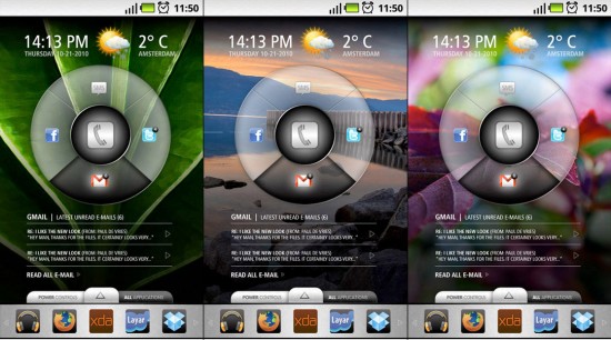
Slick UI is a home replacement currently only in the design stages but it’s well thought out and lives up to its name – super slick indeed. The “wonder wheel” in the middle rotates, displaying content relative to the selected module closest to the bottom or the wheel. The stream of info is outputted in a simple format that makes it clean and easy to read.
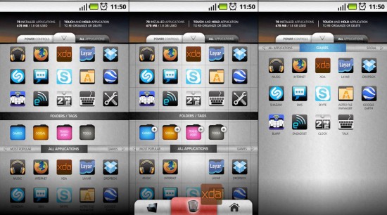
I’m a little bit less excited about the app drawer they’ve created. While it has a nice look to it, for some reason it seems a bit too busy and complex for my liking. I’m not sure if it’s the bright colors or the text – but I’d like to see some alternate app launch drawers.
Don’t expect to see Slick UI in Android Market anytime soon- the developers of the upcoming app had this to say about it’s progress as of yesterday:
Don’t get too excited yet! Work has just started, so don’t expect anything that actually works soon. There is a lot of work to be done, and we really have to think this through if we want it to ‘feel’ right.
I simultaneously hope they take their time and hurry the heck up… I’m definitely loving the “Wonder Wheel”. It seems to have some nostalgia as if the action replicates the rotary number dial of an old fashioned phone. Upcoming features are listed as “innovative app drawer” and “customizable dock”.
If you’ve got “mad coding skills and experience with android”, the folks behind Slick UI are accepting private messages over at XDA to help bring their vision to reality. And a reality is exactly what I hope this slick design becomes.






Looks ‘slick’ and all but it’s not terribly exciting. I can’t see myself ever using that wheel thingy. If I wanted a wheel I’d get an iPod.
Hah I was just posting this too. Can’t wait to see this thing come alive.
Yeah, this is one of those UIs that are pretty, but 2 weeks after you get the phone, you just disable the UI and jump back to the standard Android UI. We’ve all been there.
this is not slick but SICK!! i smell good stuff
I wanna see how fast i can spin the wheel :)
Ugh sorry that wonder wheel is just stupid. It slows you down.
Reminds me of the God awful Sense UI on my old Touch Pro 2. Nothing special looking about this to me at all. I’ve been perfectly happy ever since I bumped Touch Wiz 3.o and put LauncherPro Plus in its place. FIVE STARS for LauncherPro Plus!
I am always in the minority here but everyone wants to always bash on sense and most have not used it. I have used launcher pro and quite honestly sense is on a completely different level. I personally love sense. My wifes phone fascinate…..with touch wiz I am not a fan of.she liked a lot then I dropped launcherd pro on it and she def likes it better. I would like to see the ui and an opportunity to play with it before judging it though.
A buddy of mine had the EVO for a few months before I rooted it and installed CM6 on it. He says the phone is SO much smoother now that SenseUI is gone, not to mention a lot more free space.
@Austin While Sense might have been part of it, let’s not forget that Cyanogen is full of speed-ups. There’s really not an android I can think of that wouldn’t speed up under CM6. However, your point (in reference to this article) is valid. These kinds of “sleek” interfaces tend to eat resources.
@ Wharp – If your refering to my comment about Sense(must be mine since no one above me said anything about Sense) then you must have skimmed over the part where I said “on my old TP2” which means I have used it. More importantly though I was refering to THAT specific HTC Sense aka Touch Flo 3D which was trash on that phone. I’ve never used sense after that one.
what will it take to get this Bing trash off of the article pages!!!?
I think it looks cool, but I agree that most of this stuff gets old after a few weeks. I had a DInc for a few months so I know all about SenseUI. Nice for awhile, but had it’s issues so I switched to LP for a few months. That was nice too because of all the customization I could do to it. But after switching to my Droid X, I’ve been using the Moto thing and that’s fine too. I’m not really sure why one is so much better than the other. There’s widgets and icons and screens. I tried a ton of launchers on that DInc, and they all were decent. Best thing about LP was the custom dock icons…that should be standard on all phones.
Looks really awesome, I think its always good to see some Unique launchers and this definatly is one.
People saying you’d just go back to Android, is that not a good thing? Being able to switch between multiple Lanuchers and UI’s quickly?
That wheel….that wheel. ANyone remember the menu wheel on the old LG Chocolate 2? C’mon, they can do better than this!
that looks slick!!
A crummy wheel?
No thank you.
Meh.
Whatever happened to TAT Home?
http://www.tat.se/home/
@the fish, actually cm6 slows down the mytouch 3g to a crawl compared to stock
Hi guys, the wheel is optional. It’s just an integrated widget that can be (re)moved.
I’m not a big fan of the app drawer, but that wheel that the ability to customize everything looks really awesome. I have to say that it’s some of the best stuff thta I’ve seen so far coming from the android market, and everyone on this sites knows exactly what is out there. It’s possibley the most excited I’ve been about an app in a really long time.
This is one of those things that I have in my arsenal to show off, but don’t actually use, sort of like windows phone android.