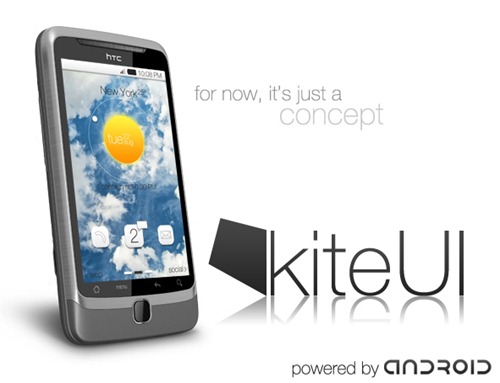
We all let out a single tear when we heard that The Astonishing Tribe – the folks who were bringing a cool-looking home replacement for Android – were acquired by RIM, but other groups were waiting for TAT to get out of the way before they revealed their own wares. A group of developers at XDA have been working on KiteUI – which, for now, is “just a concept” – and have finally released a teaser video to show what they’d like the UI to look and feel like when and if it’s ever finished. Liquidice from XDA is the man to speak to if you want to help bring this to reality. With TAT now off the market, KiteUI and SlickUI are playing their own parts in creating a prettier Android for people, and it’s never a bad thing to have more choices over stock. [via Android Police]







Very polished looking, and much better than some of the carriers UIs that are being sold now.
Woah what Droid is that.
Its a G2… Not part of the droid lineup
That looks amazing!
thats a G2 and its not a droid, its an android powered phone on T-mobile… i serously hate the droid marketing… it makes people think that if it runs android it must be a droid
@jdog25: It’s not a Droid. It’s an HTC Desire Z.
http://www.htc.com/www/product/desirez/overview.html
It is the G2/Desire Z
In the video, it looks like the Nexus One; but the pic on this page looks like maybe a Desire
i hope you are joking…? thats the nexus one
I want Zooey Deschanel in my contacts list. I’ll change her name, too, to protect her. I love me some Zooey.
why does everyone call the phones droid, its an HTC Desire Z/ T Mobile G2
Thumbs up for some MGMT
nice lockscreen from wp7 lol
@Dan It was a joke and the pic is a Desire Z/T-mobile G2 and in the video it is a Nexus One. The people who call Android Droid are just as bad as iPhone iTards, maybe they are former iTards.
This looks pretty good. Too bad that even after I finally get Froyo for my MyTouch 3G this will probably run too slow to be enjoyable.
@Muninn That’s the first thing I thought of too. Oh, and the UI looks nice.
I’ve been watching this for a while on XDA and can’t WAIT for this to come out….looks very impressive!!!!!!
looks nice and simple but i doubt i’d want to use it for more than a week… i’ll take that clock widget though
i dig the KiteUI logo… and the use of Jemaine, Chris Rudd, and Zooey
This is really nice. I hope this comes out soon. I’m probably in the minority but I was not too crazy about the TAT replacement. Their homescreen card flipper was nice and moving apps, but I thought the rest was a bit overdone.
Very nice UI
Interesting that front end UI is minimalistic, while back end reverses that. Potential battery drain on the (pictured) horizon.
This concept has been around for months… this is not new.
that’s not Robert Smith! That’s Jemaine Clement!
Just because RIM bought TAT doesn’t mean that that’s the end of TAT UIs on Android. Docs to go are a good example. We did get Docs to go 3.0 shortly after they were acquired by RIM.
Idk about this. Looks like a android/ wm7 hybrid
yeah, im all for options but I cant imagine using it for very long cool clock though
Looks “pretty” but not very usable. The fact they think that razor-thin black text directly on top of a high-contrast background is a good idea makes me think that they haven’t really thought through a lot of other things either.
It’s easy to make a slick motion-graphics demo of what a UI would look like in perfect operation. It’s a lot harder to design a UI based on what acutally works well. IMO the best concepts come from doing usability interaction testing first, polish later. This is all polish.
Nothing has changed since August… just a graphic designer with slick dreams and no substance…pretty poor reporting by this website… why hasn’t the article title been changed yet?
it looks a lot like the htc1 UI they showed in the summer.