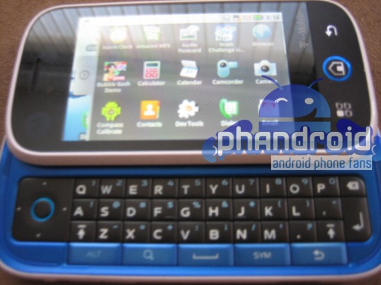
We first heard of the Motorola Morrison when it leaked on T-Mobile’s 2009 Android Time Chart. Soon after we saw the first Motorola Morrison picture. But now, thanks to an anonymous phandroid tipster, we’re seeing the clearest picture of the Motorola Morrison to date:
Apparently a Moto employee is already walking around with a working model and let this bad boy out of his sight a bit too long. Unlike the last picture of the Morrison, we can clearly see that Android is the OS.
Notice this blue beauty is emblazoned with the Motorola and T-Mobile logos, leaving no questions where it came from and where its going. This time around we can make out 3 distinct hardware buttons which previously were unidentifiable due to the white background – now Android makes a lot more sense. The buttons are (1) back, (2) home and (3) call/menu/action/something. It’ll be interesting to see how that last button with the 4 boxes functions considering the needs for “Call” and “Menu” both need to be addressed, unless done somehow or somewhere else.
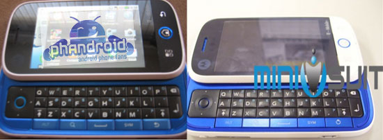
Also of interest is that this version of the Motorola Morrison is black and blue as opposed to previous pics we’ve seen that showed a white and blue model:
This is normally where the corny black and blue joke would enter… but I decline. Its too much of a softball and what this means for Motorola is no joking matter. I really hope Android helps them return their handset division to glory.
If Motorola were to offer black and white versions with different interior colors like pink, green, orange, etc… they could really have a hit on their hands with the teen market. Of course it all depends on who they’re targeting, what the price range is and whether or not the phone works well. Hopefully we’ll find out in late 2009 as this sucker is supposed to hit for the holidays!





The button with squares is 99% menu button, call button is not necessary, you can answer calls without it. I don’t like that the screen is so small.
looks nice… I would probably go into consideration of buying this one if the Hero costs more than this one…
The gamer in me really likes the directional pad where it is.
perhaps, when Android becomes more gamer friendly, a company will come out with a gamer centric phone.
I agree with the love of the D-Pad. the main reason I didnt want a Her0 (or a “mytouch”) was for my NES/SNES emulators. Cant live iwthout them :D
any word on hardware at all? even speculation?
Great looking phone I was wondering when they were going to come out with something good.
I like the idea of the DPad and the screen doesn’t bother me but I just don’t have a trust in Motorola phones anymore. I’d have to wait and see reviews on it.
I suspect the black replacing the white was a marketing decision to make the screen appear larger. Many phones do this to give the illusion that the screen is larger than it is.
As someone already pointed out the screen is small, especially noting the large bezel it has.
Also of possible interest are the icons. The camera, camcorder and calculator icons, which should be for the built-in apps, look nothing like the current android release nor do they adhere to the Android Icon Design Guidelines ( http://developer.android.com/guide/practices/ui_guidelines/icon_design.html )
finally a physical keyboard. not the best looking of phones, the screen looks a bit small….but a step in the right direction. i agree with the other posts, the D-pad is awesome, these phones need to realize their gaming potential.
ADP2?!?!? it has Dev tools, either that or its not the real phone :/
@glyco, I have no physical keyboard on my HTC Magic (Rogers, Canada) , yet I am doing great.
doesnt seem like it’s gonna be my next Android device. Sorry, the design is too childish. What is Motorala doing?
Oh dear…. it’s a QVGA phone. You can clearly see that comparing the size and number of icons on screen to those on the G1, Hero, MyTouch…etc.
@TareX, above “Android User” wrote that it has non-standard icons.
Perhaps they are larger versions of the icons with new designs, if the user wants a different number of rows and columns.
Therefore it is not possible to compute the screen size when comparing these icons to standard Android icons.
Sorry. I have no confidence in Motorola quality. I’m not going to get burned again. Motorola can go out of business and it’s no big deal to me. It’s not like we’re losing an American company… all their crap is made in China anyway..
Are you people blind? This is a total iphone rip off. Cant Motorola design something unique? Its pathetic.
This is not the final design..;its only a test type…thats all !
Motorola still make cellphones? The last MOT cellphone I saw on the shelves was a tired old RAZR– just painted a new color. I thought Motorola boarded up the cellphone business after they tried to sell it / spin it off and NO ONE wanted to buy it. Stick with a company that’s going to be around in 6 months. Motorola is grandpa’s has-been.
Many people think it looks like a kids phone but it looks good…
I wonder how it looks closed. I wonder if the blue fringe at the bottom goes under the case or not.
I’m saving my review on this device until it hits the shelves. Although, I like the way this device is going. Can’t wait to see the final version.
Yawn. Motorola is a year behind everyone else. Wake me up when this tired old dog actually has some new tricks. Besides… for the love of God, WHY should I buy anything that Motorola makes?
Please, please, PLEASE let there be a normal black interior version. In the previous photos where the device was all black it looked so badass. A perfect iphone alternative for those who prefer a physical keyboard. But the blue interior… what on earth are they thinking? It takes an awesome phone and makes it look like a cheap toy.
it does not look very professional. looks like a toy.
and oh, i saw this guy using the same thing out in the public one time. so its out in the market?
talk is cheap, and whining like a bunch of bitches at the nail salon is pointless. this is obviously a prototype, and how the final one looks like is pure speculation.
Will it be really as good as the iPhone or the Nokia N-97?
What about the battery life? Motorola’s perennial problem. A phone with such a powerful processor and a rich RAM (256MB) will need a monster of a battery and going by Moto’s power management and batter life history, it may become a disaster…