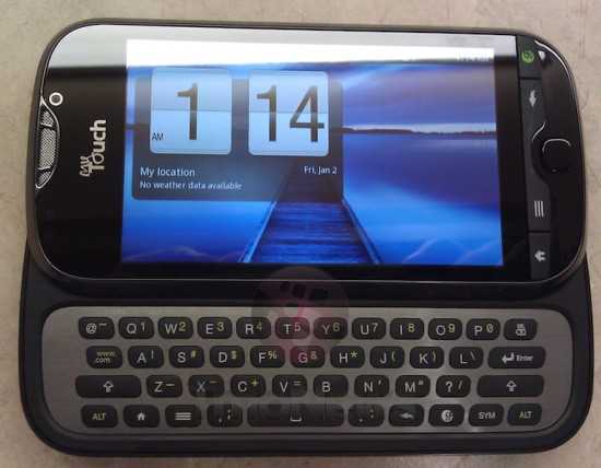
 And there you have it – a clear shot of the MyTouch 4G Slide. Not much has changed from the blurrycam shots we’ve seen before. In fact, we’ll just call this a MyTouch 4G with a keyboard. That’ all it is, anyway. Trust us, that isn’t anywhere close to being a bad thing. We do have a bit of new information on software, though – it’ll surely be running Android 2.3 with HTC Sense on top. The keyboard on this thing is said to feel solid, but we didn’t expect anything less from HTC’s tried and true design. It’s coming, guys. [TmoNews]






Looks like the same terrible keyboard that was on the G2/DesireZ.
i have the mytouch 4g. im getting thisssssssssssssss the day it comes out.
great phone
t mobile ownssssssssss
Well it looks like I have found my next phone.
I just wish it had a bigger screen. After spending time with the Sensation and G2x its going to be hard settling for a small screen .. but I need a keyboard.
I wish theyd just make the perfect phone with a hard-key 5 row & a 4 inch+ screen..
There’s the motorola droid3/milestone3, but that thing has a bad pentile screen. There’s also the Dell Hancock that made its appearance only on a leaked slide showing dell’s roadmap. I’m hoping for the latter not to have a pentile screen.
PENTILE IS NOT THAT BAD! id take a pentile super amoled 1 over any lcd/ips/slcd/oled crap any day pentile or not.
I have used a number of phones with pentile screens. None of them can compare to a non-pentile screen in terms of clarity. I very much prefer a tiny 3.2 inch 480×320 screen over any pentile screen of any resolution, because the colored outline around text caused by the pentile arrangement is absolutely disgusting.
Even Samsung agrees that a nonpentile screen is better than a pentile one. http://ydfgg.com/2011/02/21/super-amoled-plus-gets-crisper-with-doubled-subpixel-count-thanks-to-real-stripe/