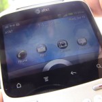
This little bugger just walked into my house ready to be turned on and used to no end. It’s the HTC Status, AT&T’s version of the ChaCha and their first “Facebook” phone. Ahead of a full review, I wanted to take a quick look and give you guys my impressions upon using it for a quick hour.
Keyboard
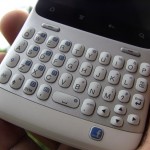
This is easily the biggest attraction out of the box. Yes, even moreso than Facebook. Long story short, it rocks. The keys are nice and spaced out, they have good tactile feedback, and they have great track and feel. This style of phone is becoming increasingly popular in the world of Android and I think HTC has produced one of the best portrait keyboards you can find.
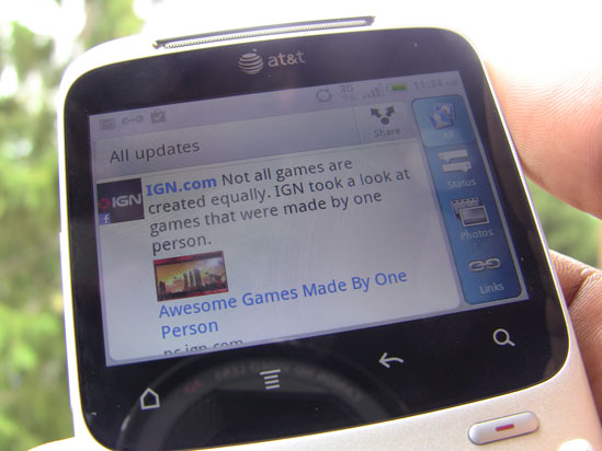
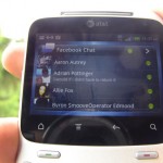
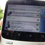
Facebook integration isn’t as deep as I imagined it would be. The application itself is customized by HTC for the smaller screen, but it’s still Facebook at the end of the day. It works, though, and has enough features to make it a passable experience.
If you already didn’t like the Facebook for Android application, this one won’t win you over. This one is even less of an application with the lack of notification options compared to the version available for all phones. And what’s more is HTC includes that version of Facebook, giving you two different applications that do the same thing and provide nothing major over the other.
Oh, and about that Facebook button? It’s cool, but very limited. Being able to post a status with the click of one button is cool, but making it a dedicated notification light for Facebook (and making it be able to open whatever notification it’s alerting you to) would be even better. They’ve also separated the chat application here to make it seem more “integrated”, I suppose. All in all, not too wowed.
Display
Despite its small size, the display on the HTC Status looks great. The 2.6 inch display still packs in a 480×320 resolution so you won’t be struggling to read text on websites and in apps, and your games, photos and video won’t look half bad. The display supports multitouch and is every bit as responsive and vibrant as their bigger phones. We like it.
Software
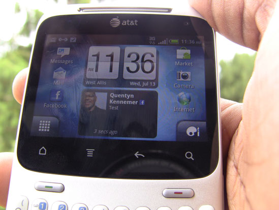
HTC Sense has been customized for the smaller screen here. In the software information section of the About Phone menu, HTC calls this Sense 2.1 for messengers. The biggest difference you’ll see is in the apps tray and on the homescreen. The former gives you your sorting options (all apps, most used and downloaded) on the right instead of the bottom.
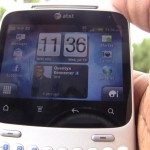
The homescreen gives you your apps try button on the left and the personalize button on the right. They did away with the phone button, but that’s because this phone has dedicated end and send keys. The homescreen also only has 5 homescreen panels as opposed to the seven we’re used to on other Sense devices.
It’s also worthy to note that the personalize and apps tray buttons are only visible when on the far left (home) screen. Both the home screen’s position and the lack of button on all screens are weird departures from the norm but HTC wanted to provide four rows on the rest of the homescreens as the buttons make room for only 3 rows of applications and widgets. HTC Leap has also been included despite the small display.
HTC’s included Scenes and, to our surprise, the same new lock screen found on the EVO 3D and the HTC Sensation. It’s not as customizable, though, as all you’ll get to define are which applications you can launch from the lockscreen. Still, we’re glad to see it here.
A quick note regarding the display’s orientation – applications with landscape support will automatically default to landscape with no way to switch to portrait, and vice versa. We expected as much, but it’s something to note and get used to if you’re coming from a touch-only or slide-out QWERTY device.
Hardware
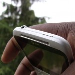
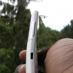
Small, light, curved but stylish. It’ll feel great in your hand and in your pocket, but someone looking at it from afar may mistake it to be a toy. You get a curve in the middle of the device for ergonomics when typing, and I must say that it does help. I felt comfortable typing on this keyboard. Anyone who knows me knows I hate portrait keyboards because hands of my size just aren’t that compatible. The slight curve really does help.
It’s a solid-feeling device. Although small, it doesn’t feel too light and its size keeps it from feeling too heavy. Thankfully, you can take the battery door off and remove the battery at will. above the battery are slots for the microSD card and SIM card. The battery door is a bit tough to pry open but you’ll get it off cleanly if you’re careful. Also, as I mentioned above, physical call end and send keys are present, with the former doubling as a home button if you’re not on a call. The usual suspects are still here as far as capacitive buttons go.
Performance
Inside is 512 MB of RAM, 512 MB of ROM and an MSM7227 800MHz processor. All are sufficient to run Sense and Android with nary an issue. The hardware is enough to support a smooth Live Wallpaper experience, too. We’re glad HTC’s included this affordable and efficient chipset as it’s still quite capable of running Android at a smooth level.
It runs games very well, though the orientation and size of the display may turn you off for longer periods of play. The display is presented in landscape mode when holding the device upright, natch, so games (and apps) that exclusively use portrait view wil require you to turn the device on its side. It looks a bit awkward, but it’s a much better solution than not supporting portrait-only games and apps at all.
Camera
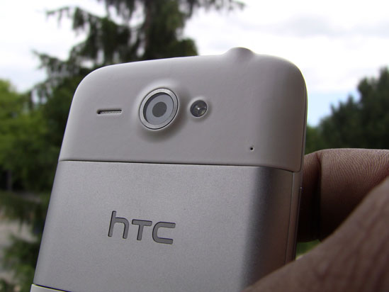
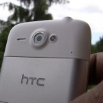
The five megapixel camera looks every bit as good as ones on their high-end phones, it looks like. What’s more is that they’ve even included an LED flash, something susceptible to being non-existant on other devices of this size and style. It has a front-facing camera, too, so you’ll be able to participate in video chats once Facebook brings that to the Android platform. Good thinking, HTC.
Overall
It looks like a solid device, but nothing mind-blowing in regards to Facebook integration. We expected a bit more from that “context-aware” button, but it doesn’t do much but provide a quick shortcut to post a status update. (Holding the button down will also allow you to quickly check in to places.) Ultimately, the form factor is good for folks who prefer this style of keyboard and the internals are enough to ensure a smooth experience.
It’s a solid phone and one worth taking a second glance at if the keyboard is a main concern of yours and you wouldn’t mind a smaller screen. Otherwise, it’s not that different from other HTC or Android phones if you were to just buy those and download the Facebook application from the Android market. Be on the lookout for our full review in the coming days after I’ve had a chance to see how it performs over the course of a week or so. A full gallery of images awaits you below.










seems like a nice phone just not for me though i must be one of the few people out there that doesn’t use Facebook or twitter
I’d never use one, but it’s still cool. I prefer my screens 4″ +
I’ve tried one myself and the keys certainly don’t have “good tactile feedback” compared to a blackberry phone or my LG. It’s much like pressing sponge.
I’m just picky with keyboards so go ahead and ignore me.
I actually disagree here. Which version of the ChaCha were you trying?
the ChaCha. we don’t have rebranded subsidized phones around here.
It is crazy that this phone is barely coming out but it got leaked in December of 2009.
What htc should of done is remove the capacitive buttons and make them hard buttons near the call and end buttons, thus allowing for more screen real estate.
what htc should have done is made a google+ button instead of a facebook one
I just don’t get it. On every android phone you can add a facebook icon on your home page, so the facebook button seems unnecessary. At best it might save me a few seconds of my day. Plus you can see the pictures almost twice as big on a touch screen phone. I’m not sure even a huge facebook fan would choose this over the touch screen, unless they want a physical keyboard which then still makes the whole ‘facebook’ integration unnecessary still.
So that’s what happened to my old Motorola Q. Someone painted it white and loaded Android on it.
Big question is, how does Google+ run on it? (And Twitter?)
Actually this is a fair question, someone that’s so into social they’re likely to by a dedicated Facebook phone, is also likely to more than one social service…