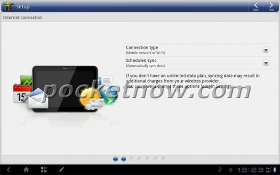
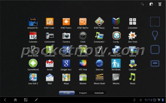
We didn’t expect HTC to jump into the Honeycomb tablet game without putting their stamp on the software, so we weren’t surprised when these shots courtesy of PocketNow surfaced. They’re screen grabs directly from the HTC Puccini, AT&T’s and HTC’s first Honeycomb tablet.
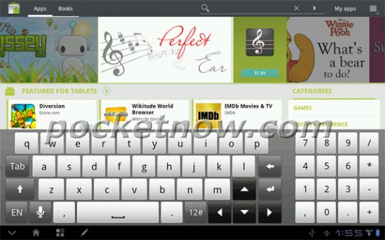
Right away, you can see where HTC’s made their mark. There are several HTC-specific applications for setting the device up and other special functions. You’ll also get HTC’s keyboard for tablets, which features a full number pad offset to the right. Pretty slick.
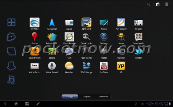
As you can see in the bottom tray, not only have they changed some of the icons up but they’ve also added a pen button, likely for the same Scribe pen functionality that can currently be found on the HTC Flyer.
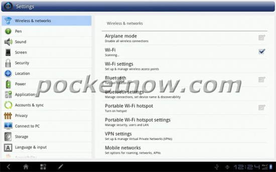
The settings menu has also been spruced up a bit with HTC’s colorful suite of icons and a light background instead of a dark one. In the shot below, AT&T’s stamp is clear – bloatware, and tons of it. That’s not to say we’re not used to it by now, but we hate seeing this much preinstalled software on a Honeycomb tablet.
Looks pretty interesting, I’d say. We’re not sure if this build is near-final, but HTC could have more in the way of customization by the time this thing comes to Ma Bell.









HTC… What can’t they do? Too bad the price will more than likely be ridiculous.
Why would anyone buy a mobile enabled tablet these days? So they can pay extra money each month to get 2 GBs of bandwidth or slightly better than dialup speeds after paying an additional hundred or more dollars just to have the option?
Seriously just get a WiFi only tablet and you don’t get AT&Ts bloat, problem solved.
I would if you could pay month to month. That be pretty ideal.
You can if you want. You just have to get them unsubsidized and off contract.
Why would they make the menus white? The darkness is part of what makes h=Honeycomb so beautiful. Oh well; I’m holding out for Eee Pad Transformer 2.
Robert,
Don’t try telling Phandroid readers that OEM shells aren’t all that appealing on Honeycomb or that Honeycomb is perfectly fine in stock form–they’ll tar and feather you.
BTW I’m in 100% agreement with you.
Speak for yourself, I too agree with him.
Haha
I was just joshin.
Two days ago I expressed my dislike for TouchWiz UX and everyone seemed to be offended–at least the fanboys.
Really? I was under the impression that a lot of people have a ‘great dislike for TouchWiz’
Not the Samsung fanboys.
http://ydfgg.com/2011/08/03/touchwiz-ux-update-headed-to-the-samsung-galaxy-tab-10-1-beginning-august-5th/
I’m definitely with you against TouchWiz UX. I think that Honeycomb is absolutely gorgeous stock and shouldn’t be messed with. I’m a fan of Sense on phones, but I don’t think Honeycomb should be disturbed.
that thing looks ugly…so now its time to speculate is this the vigor for verizon??
there goes the punic RIP hope for a good HTC tablet
Now if Best Buy gets a version I will be buying this thing…
With every tablet that comes out, I’m more and more glad I got the XOOM. No bloatware (well, very minimal anyway) and no unnecessary UI overlay bulls#!t.
hopefully you didnt buy it when it first came out for 800
Htc has really gone to shit. I remember there was a time I wouldn’t even consider an android phone unless it was HTC. Now I can almost guarantee my next phone or tab wont be from htc
I’m still a big fan of the Sensation and Sense 3.0.
another confirmation that my purchase of the Transformer was the right one
I’m really interested in the stylus, but I’ll have to see just how deep sense ui goes on this thing.
Speak for yourself people. Stock Honeycomb and stock Android suck. Why should I have to download so many app to have the same feature as my sense 3.0. The lock screen on sense 3.0 is great, so is the pull down notification.
You better be able to change the layout of that landscape keyboard, because that number pad on the right side is stupid. There’s a reason why the kaboard takes up the whole screen, and that’s because it makes it easy to type. Way to cramp the keyboard and miss the point, HTC.