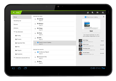
Google Docs for Android has been updated, bringing about a brand new user interface for the app when used on Honeycomb tablets. A new three-panel view allows you to filter and sort through documents, view details, and even see a file preview all at the same time. The layout takes advantage of the greater screen real estate afforded by tablets and unleashes improved functionality, something the mobile version of Docs has been lacking. The new version is available now in the Android Market. You can head over to the link below to download it to your device.
Android Market Link: Google Docs
[via Google]


Ohh, I’ll test this now. Google Docs used to be abysmal in tablets.
Nope. Still crap when you’re actually editing documents. No formatting options and you can’t use directional buttons to navigate between paragraphs. I don’t understand why that’s so hard.
Agreed…wish it was layed out like word
Word.
So excited for this, especially because I just got a bluetooth keyboard! Unfortunately, my Xoom is still out getting its 4G implant…