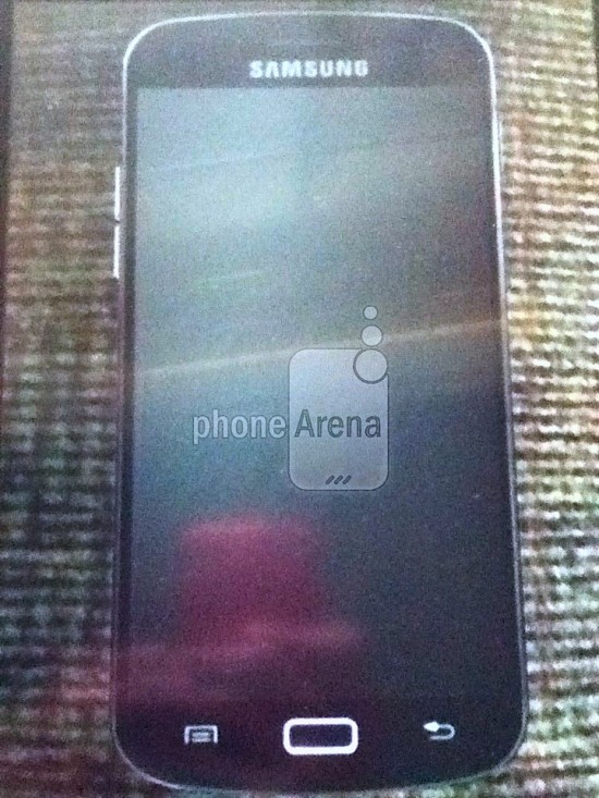
I was just about to hit the lights and turn in for the evening when this popped up. What is it? Well, it appears that we’re looking at a real, bonafide Samsung Galaxy S III. Well, without that hideous prototype “dummy” casing we keep seeing over, and over again.
If this design looks familiar to you, it’s most likely because this devices looks almost damn near identical to another flagship device, Samsung and Google’s own Galaxy Nexus. If you hold a G-Nex up to the screen, you’ll notice a few small differences like less bezel (due to a larger 4.8-inch display) and what could be a slightly different speaker grill. Oh, and there’s that glowing physical “home” button, complete with capacitive buttons along each side of it.
Remember, current rumors have it that the Galaxy S III would only be a slight update from current GS2’s. I honestly can’t say I was expecting too much from Samsung, but this is… I’d say this looks about right. Earlier today, a leaked service manual showed us the Galaxy S III design that matches this to a tee. Yup, I’m going to call it in, folks. This is the real deal. Got my shorts ready. What do you guys think? Love it? Hate it? Still calling shenanigans?




‘IF’ this is real then I’m very disappointed from a design point of view.
just as Paul replied I’m amazed that any one able to make $6417 in one month on the computer. have you read this site==>> http://sure2go.blogspot.com/
I’d buy that for a dollar….. actually I will be buying it for ~£500 :D
me likely… the lighty
Ugh, that’s pretty hideous. Looks like the Nexus and an iPhone had a baby. Now we know why they’ve been hiding it…
The silver rim you’re seeing around the outside it exactly like the Galaxy Nexus’s. I know it looks like the iPhone’s metal band from this shot but it’s probably not (I hope).
From this shot I’d say it looks much shinier than the Gnex.. probably aluminium instead of painted plastic.
I like it. Im a fan of the nexus design. Barely any side bezel wow. Regarding the home button im sure once we get it in the US theyre gonna make it like the nexus.
Yeah. Wouldn’t be surprised if they drop the home and capacitive buttons altogether.. Could easily go soft keys for the US.
I hope so. :(
I certainly hope not. I don’t want my screen space being taken up by buttons. And of course there’s going to be otherwise unused space at the bottom of the phone whether there are capacitive buttons there or not, so we might as well use it!
the home button wake the device easier than the power button
I don’t really see the logic behind that, if anything the US version has lagged behind the international version in design changes, the S2 still has 4 buttons including a search button, which the international version dropped with the S2, I’m not looking forward to losing my search button, I actually prefer it to the galaxy nexus search bar. I’m hoping they’ll stick with the same design, having capacitive menu,home and back is a plus to me.
Why not go all soft buttons? That’s what I want.
Have to admit I like it. I don’t expect too much from Samsung in terms of design so this meets my expectations. I love the thin bezel at the sides.
Looks better than the previous Galaxy phones (minus the Nexus)
Seeing as I think the Galaxy Nexus is still the best looking phone available (it only trumps the S3 by not having physical/capacitive buttons )
You think the GNex looks better than the One S, One X, Lumia 800, Lumia 900, iPhone, and a bunch of other HTC, Sony, and Nokia phones?
Doubt the latest “leak” from PA. My reasons —
1] {bottom-left corner of the pic} you can see a reflection of the person’s hand on the carpet!
2] since this phone has its screen off, why are the physical buttons lit up?
3] why would the multitask button look like the standard menu button?
4] they probably aren’t real buttons – but stickers. Certainly looks like the GNex… with photoshopped SGS2-styled buttons.
5] Check how SAMSUNG is engraved on the front. Absolutely horrible photoshop. Just pure fake.
http://4.bp.blogspot.com/-A_ldAimmFYU/T5r9WjDZ_aI/AAAAAAAAAT0/Wv0Nytj1NH4/s1600/Samsung-Galaxy-S3-fake-compare.png
Wow, how did no one notice that this is a shopped pic of a GNex? It’s so obvious!
On one hand, this could be behind glass, which would explain the reflection, and the sides shine too much for a gnex.
On the other hand, That home button glows way too much, it’s a departure from the hidden buttons Sammy is known for.
dude done like a boss. proves how gulible some people are. We should do more research like you did.
I was hopping that this would be slightly smaller than the Galaxy Nexus as that phone is Huge. But will wait & see other wise I might have to wait for the Motorola Razr HD??
Heard a few rumours about two products being released, some people think it’ll be a tablet but I wouldn’t be surprised if it’ll be two size variants of the S3 (not dissimilar to the HTC One S/X). I like 4.8″ but seeing as a lot of people call anything above 4.3″ too big it’s hard to see Samsung push it as their only flagship size.
Would be smart to wait until both phones are released to make a good in-person comparison. But if the S3 ends up only getting a dual-core processor in the U.S. then I’ll wait until next year. Expecially since it’s looking like my phone will be getting ICS next month anyways. It’ll be like having a new phone.
Looks more or less the same…but love the glowing home button…hopefully it can be a notification light as well…wht im really looking forward to is the material covering up the body..
but just like all the galaxy series (well just 1 & 2 but still) they are going to replace that beautiful glowing home button with touch sensitive button… bummer… i wish we can get the physical home button like the international version (maybe its just me…)
Hmmmmmm That looks like a Galaxy Nexus to me.
Looks like an overgrown iPhone with some nexus cues
I won’t say it’s or isn’t fake, but the picture has been clearly altered. The reflection of the person taking the picture of the phone can be seen OUT of the screen of the supposed GS3. Who is that possible? Was it behind a glass?!
I see what you mean…now I am starting to have doubts…could have jsut been an edited Gnexus.
Well may 3rd aint far….I already got my phone that ‘ll last me another 1.5-2 years, So I can wait :D
It is a picture of a picture. Look closely.
You can see the edges of the picture that he is taking a picture of.
Also the phone almost looks 2D.
I love the phone overall but hate the buttons, would have loved a cleaner front by making them virtual buttons.
the problem w/ no buttons is when the phone lags, i like to know I can register a physical input rather than wonder if it is just the screen/touch lagging.
There shouldnt be any lag with that quad core Exnos processor
a ‘physical input’ is converted to a software input so if the software is frozen then it doesn’t matter what physical buttons there are, the software still has to read/act on it.
cant expect much from design point from samsung..but if this is true..then the camera is still 8 mp..and 4.8 inch??..i already find it JUST manageable with s2..overall a appointment after all the hype..awesome design.. nope…2ghz quad core..nope..2gb ram.. nope..12mp camera..nope..now only left from confirmation is ceramic body..and the wireless charging..
If this is real, once again Samsung moving the keys around again, what is Wrong with them, I want the back key on the Left Side not the Right it more useful on the left
the s1 has the back on teh same side, so i dont’ see why they would change it…
Samsung has been good with their industrial design on flagship devices and that thing is simply fugly. The chrome edging around the perimeter, the large radius corners and bulges on the top and bottom — more reminiscent of a middle-aged man in physical decline than the sexy design I would expect from Samsung. I think and hope it is a fake (this was going to be my next phone).
Also notice the entire front is glass yet a teaser picture released by Samsung a couple weeks back showing the bottom front had a curved non-glass material more like some of the HTC’s. I really don’t think Samsung would let their flagship device have an outdated chrome edging on the perimeter either. Chris, I would strongly suggest you stay away from beans and spicy foods from April 30 on…
Awesome. I love the thin bezel.
No touch screen buttons and 4.8 screen gives you more screen to work with than the Galaxy Nexus.
The problem with hardware buttons and 4.7+ inch screens is that the hardware buttons conflict with the screen size when most people are using these phone/tablet hybrids in landscape mode to browse and only turn their handset upright for phone calls. The U.S. capacitive buttons are ugly and the hardware home button is too iPhonish, the GNex actually pioneered a design space in controls that nobody seems to have taken to for some really strange reason
Mr Chavez i refer to my previous comments. I’ve seem your shorts and they still don’t seem edible. Lol
Just like the EVO LTE, I need to see the official shots before passing my final judgement. So far, the EVO is winning though.
Since there is a galaxy nexus ad right next to the pic the comparison does look very similar and that screen looks like every bit of 4.8in interesting to say the least
I looks too rounded to me. I hope this is not the final version.
Yuck! Physical home button….fail.
funny, i quite prefer having the physical and capacitative buttons on my S1. i see that as a selling point rather than a detraction
Maybe it is just the picture but that phone looks long and narrow. I feel like I would need a finger extension to reach the top parts of the screen? I hope that is just a bad shot or not it at all
That’s what 720p or 1080p screens look like, my rezound which has a 4.3 inch 720p screen, the screen is about .3 inches narrower and that it made up by the length because of the different aspect ratio, that’s why people automatically think that a 4.6 – 4.8 screen is going to be too huge, they are thinking of adding the space onto their 4.3 inch device, in reality a 4.6 – 4.8 in 720 or 1080p device isn’t as wide as you’d think.
This looks like a paper cut out…
Unless this device will help you score with lingerie models, I just don’t understand the hype. The way some of you act, I want to beat you up for your lunch money and give you the wedgie of your life.
If this is it…it can stay in the UK.
It looks alright. It looks like a mix between a Galaxy Nexus and an iPhone. I never understood Apple’s lawsuit over the Galaxy Tabs… but the Galaxy S phones do look TOO much like iphones. I hate the ‘home’ button, as iphones are pretty ugly to me.
There had been leaks of a ‘Galaxy S III’ with ALL onscreen buttons across the bottom… I was so hoping that was the real thing. That mock up was sexy.
what?? this is for a real?
Ladies and Gentleman, I give you the SGSIII. A Gnex with stupid hardware buttons and a useless Samsung logo on the front. If this truly ends up being the SGSIII, it’s a total fail from a hardware design perspective.
If it’s real, I’ll be TOTALLY disappointed.
No Exynos 4 Quad in the US + This … just simply screw the GS III
Y’all are just wayyy too obsessed with the iPhone. I donno but when I look at a Galaxy device the iPhone never comes to mind. Even with the Home button, because iPhones Home button is round with a square in the middle and Samsung’s is a thin rectangular shape… plus they are bigger than the iPhone! So please, stop with the comparisons because to me the SG’s are not iPhone look alikes. Now when Samsung starts using a round Home button, a glass housing and a logo of a bitten apple on the back then I’ll start looking at them sideways -_-
People don´t read this is a “dummy phone”.
The Qualcom rumor is just stupid, a simple rumor…
the Qualcom rumor really isn’t stupid, chip manufacturers have to work very hard to get LTE into their SoC’s, that’s why qualcomm S3’s dominanted the LTE phone market last year, I won’t say it’s impossible that the new Exynos quad chip won’t support American LTE, but it’s possible they will go with Qualcom for the US, Even if it does support American LTE, it’s quite possible they will still not use it in some models samsung frequently uses different chips in different models due to manufacturing constraints.
hmmm….
Looks good to me, if it gets good reception I might be tempted by this on verizon in the fall, personally I like the physical home button and two capacitive buttons, for me the menu button and back button being always right there is a good thing, and it’s saves screen real estate, why do I want to use a section of my screen for buttons, even if it’s only part of the time. I also fail to see all of the arguments on phone “design”, I’m sorry but as much as I love android most phones have pretty much the same “design” candybar, black slab (with the occasional white back), rectangle with varying degress of curves around the edges, and buttons of some sort at the bottom. Their isn’t a whole lot you can do with the design. Arguing design of an Android phones is like arguing about which shade of black is best and this really isn’t confined to android phones, WP7 is the same as well.
I understand if you have a preference, that’s fine, but going to such extremes as gorgeous and fugly, or saying one aspect makes the phone a failure, seem hyperbolic.
It seems to me that most Android fans simply take whatever design choices google makes and parrot that they are the only acceptable design choices for a phone.
Google included the option in ICS to have physical, capacitive or on screen buttons because different people like different things. It’s not a bad thing to diverge from what google decides.
It’s not a groundbreaking design, but if this is the SGS3, then I’m happy. My problem with onscreen buttons is they lead to additional wasted space on the device below the screen. Until we can get edge-to-edge screens on both axes, I think this is the better decision. So if SGS3 ends up being a Galaxy Nexus + TouchWiz (which I’m ok with), a fast quad-core processor, better battery life, and a slightly larger non-Pentile HD display…damn, sign me up (if it comes to Verizon).
Looks like the droid charge kinda. If there gonna have capacitive buttons then please include a search button! If on screen then you can root it and customize it.
I don’t believe this is the final model or at least not the US version. ICS is supposed to do away with the Menu button seen here, and ICS has no need for any capacative buttons. Seems like wasted space and money to me, unless they are just looking for familiarity.
Never liked the Nexus design. Hope this isn’t the SIII. Not that I will buy it anyway, but I would like to see the SIII have a very sleek design. And actually look more high class.
The more that is coming out about this phone the more it seems its just not gonna live up to the hype.
The only thing that has ‘come out’ about the ‘next galaxy’ is that it’s going to be using a quad core. Everything else has been rumours and photoshoped images.
This is the Galaxy s3 Notice they’re the Exact same phone. the one on the right is the gingerbread version and if you look to the left that is the ICS version aka the final version. Hence why it has a new touchwiz , and also supports 5 rows. notice the home button is a physical button but it also glows. May 22nd was the inital unpacked date but was moved up due to the Olympic Games start. Look at the phones colors remind you of the invitation??? We’ve been looking at the phone for a while now just didn’t know it. Also look at the location on the screen “London” Also notice it says live broadcast on the phone. Look at the time 7pm to 8pm anymore questions???
So obviously fake… this is a photoshoped Galaxy Nexus.
I think this is a fail… They should have had it with no buttons at all… The only thing worth on the phone in my opinion is the processor.. other than that, I wouldn’t consider buying this phone over the EVO 4G LTE
I dont get why everyone is complaining about the hard keys. In have a gnex and the soft keys are a COMPLETE waste of screen real estate. I think this device seems to take some of the gnex weaknesses and improves upon them. Hopefully that includes better radios and good reception. Don’t expect to see this on VZW either way. :/
I like the design of the Galaxy Nexus.. it’s so sexy when you hold it in your hands the front of the phone looks all black. I love the idea of software buttons makes for a clean design, but hate how it takes up screen real estate.
May 3rd isn’t far away well just have to see if it was worth all the hype and wait. I don’t believe this is the real GSIII, Samsung’s done a very good job of keeping it a secret as for that file with the specs on it. Anyone could’ve made that, hang tight guys They won’t disappoint !
I’m not sure why so many people here have a hate-on for physical or capacitive buttons. I rather like the idea that if I have a 720p screen I’ll actually _have a 720 p screen_ and not be cheated out of part of it by a virtual button bar. Not to mention they’ll be more responsive than on screen buttons, especially if the cpu is chugging or any given program is inefficiently coded.
Does no one else thinks this is a ‘shopped GNex?
The Samsung logo is not straight and it’s missing part of the text at the very top.
Also, the buttons on the bottom appear to be slightly diagonal, i.e. not in-line with the rest of the phone.
Looks, smooks. Has anyone seen a definitive answer as to whether the USA S3 (SIII) will or will not be quad? I’m considering the Sprint version.
Ya its fake its just a galaxy nexus wit stickers.
Maybe a bit more developed than stickers, probably a photoshop job.
Here’s a mock-up and i think it looks epic!
where’s that from? I’m liking the shape of that home button more, although I’d prefer no physical buttons altogether.
http://www.sammobile.com/2012/04/27/no-matter-if-youre-black-or-white-gt-i9300-mockups/
looks like a nexus minus the soft keys
HEY GUYS!!!!!! They accidentally put a video of the SGS3 into an Exynos demo!!!
Check this:
http://www.samsung.com/global/…
Video is titled: “Introduction to Samsung Exynos Processor’s Performance” around the 52s mark.I’ve attached a screenshot, judge for yourselves.
Those are Galaxy Notes….even says so on the video
HAHAHA ooops :S My bad! I got a little too excited, I need to learn how to read. ;)
It sure would be nice to have a 4.0″ version with the same small bezel. This looks way too big. Maybe then I could put up with Touchwiz long enough for CM9 to support it.
I like it! I’m glad they didnt do soft buttons. I really dont see the point. It just eats up screen real estate
This is why i still can’t believe on this leak. I removed the logo and the buttons using some of my Photoshop skills. Looks familiar? :~~
http://img38.imageshack.us/img38/9809/sgs3render.gif
Nice find! Now the fakery is pretty much glaringly obvious!
Looks nice to me, I loved the G Nexus design but I am kind of sad to see noone adopt the onscreen buttons, imo any screen over 4.5 inch, should have them. I have rather large hands an still find a small amount of difficulty using the Skyrocket one handed with.
where are the grooves on the side of the phone? :(
if you think this is the s3 your stupid even the s1 have a better design then that, its not a nexus galaxy because the volume buttons are too high up and thick to be that
A little trip around the Next Galaxy http://www.nextgalaxybirthday.com/
samsung will try to solve problems from S2 and new challenge from Nokia lumia series
http://www.priceof.org