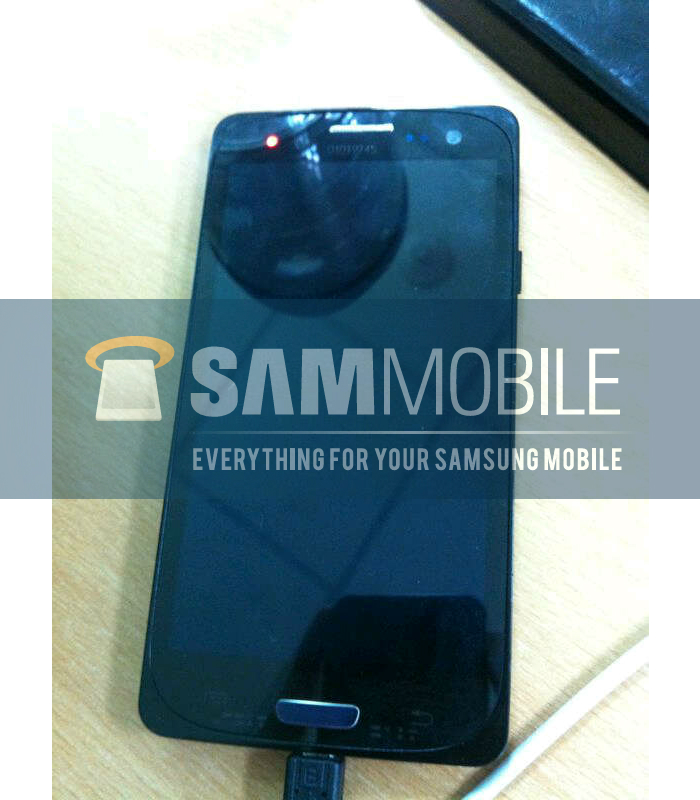
New images have surfaced showing what SamMobile is saying is definitely the Galaxy S3. While we won’t be so quick to make a definitive opinion either way, it does look similar to previous legit leaks and this device gives us no reason to believe it wouldn’t be the successor to Samsung’s most illustrious smartphone line.
Of course, there’s not much to go 0n — there’s only so much you can do with the front of the device. Like previous leaks, the physical home button in between the menu and back buttons looks quite different compared to previous Galaxy S devices, but the rest of it looks roughly the same. There are only two more days until the big event so circle back to take in all the official goods! [Thanks to everyone wh0 sent this in!]





UGLY, NOOOOOOOOOOOOO
Yeah, that’s why the protective case is on there to hide the real look of the phone, genius.
No case on it bud.
Other than the obvious one you can see the seams for, especially at the corners?
Ah… That’s a case? I thought that was some design they were trying to use. Lyk some curve screen and have lyk Matte or whatever. In other words, I didn’t see that as a case. Hmm…
Its the dummy box we’ve been hearing about for the last few weeks.
To me, it looks like an incorrectly shaped screen protector. One that doesn’t go all the way to the corners, but is rounded on top and bottom.
Is it just the photo or is that home button blue? Explains those blue blobs on the invite…
I kinda like its look and especially like the notification light.
The LED looks like the one found on the GNex just set to a diff color
Im sure this would be the international version . I guessing if sprint gets it they will do all there lil tweaks like the epic 4g touch .
The Sprint Samsung Galaxy S 3 Epic 4G LTE Touch?
HD!!!!! How could you leave that off!?!
Sprint Samsung Galaxy S3 Epic 4G LTE HD Touch?
Sprint Samsung Galaxy S3 HD 4G LTE Epic Touch?
Yea… I give up. LoL!!
yOur O key seems to be stuck On. KnOw what I mean?
That would be a 0(Zero) as its right ab0ve t0 the o….herp 0 derp!
GO0d eye.
o_0
Eye see what y0u did there
Not digging the chintzy “shrink-wrap” lookin’ border.
My guess is that they ‘dummy’ shell they’ve been using in previous photos to hide the actual look of the phone. The real shape of the phone would noticeable after that was removed.
It’s a case to disguise the phone as an S2. The inside part is the actual shape.
It’s got a Galaxy Nexus screen protector on it.
hardware wise its pretty standard & simple but I was hoping for that, hopefully the specs are on point …
‘Fraid that’s not a notification light. It is the proximity sensor shining in infa-red. Some camera lenses cannot block this type of light well and so in glows in pictures. I really like the design but need a little convincing on the home button.
There’s already 2 dots next to the FFC. I’m pretty sure that’s an LED.
Infrared (btw that is how you spell it) shows up white on cell phone cameras. Don’t believe me. Point your cell camera at the end of the TV remote and press a couple buttons.
Looks like it’s still housed in an external casing. The real design should look G.Nexus-esque
EVO is prettier
definitely, although your going to get crucified
^ LOL @ This Guy….. ^
From the number of Likes, seems it’s more of a LOL on you.
Its not about the likes, its about the message.
Yet we all know the Evo 4G LTE looks much better.
Better than an unreleased, unannounced phone in a case meant to hide its final design? Okay.
The first guy didn’t say EVO LTE. he said EVO. The original EVO was ugly, and so is the new one. HTC phones all look Fugly except the new One X.
argh! that home button is ugly as hell. Never like Samsung smartphones for that centered button (except Galaxy Nexus). It Looks ugly in iPhone and it surely looks ugly in Samsungs models too.
thats a fake home button taped on the external case. Dont get too dissappointed yet..
Not necessarily. Every international Galaxy up to this point has had that same home button.
In my opinion that phone is super fugly…. If it looks anything like that I won’t be getting it. And why is
Quentyn Kennemer leaving out information??? Direct Link
http://www.sammobile.com/2012/05/01/this-is-the-galaxy-siii/ Anyways supposedly it has a 12mp camera. Also this is
Model: GT-I9300 but they’ll also supposedly be showing the
GT-I9800. Anyway IDC for it much and actually like the notification light on the Galaxy Nexus better.
I’m underwhelmed
The design shows very rounded and large sweeping corners. Not sure if I like it. The front shows 3 sensors and a camera…hope one is a notification led.
Something tells me this tester won’t be testing much longer. They’re phone markings are showing on either side of the home button. Ooops!
Anybody else think it’s retarded to have such a tall HD screen but still only have 4 fuckin rows of icons and no on screen buttons??
The G’Nex has a dedicated search bar to take up some of the extra space but after looking at shots of the One X, there’s huge gaps in between icons wasting space.
I have 5×5 icons on my GS2 via ADW and I couldn’t imagine going back to 4×4 with super high resolution.
Apparently it will have 5 x 5 icons???? We will find out in 2 days
4×5 maybe, hopefully. 2 days man 2 days!!
Lol thats a feature you can change with a few small twesks
Not with TouchWiz on the GS2…
Idk about TouchWiz cause i don’t have a S2 but have your tried a diff launcher ? like Apex – it has the feature
“you can always change it the way you want anyways…. its android after all.”
Me: “Thankfully, but I would like to actually use the stock TW launcher some day. Maybe with TW6 but for now, it’s ADW until I can use NOVA.”
you can always change it the way you want anyways…. its android after all.
Thankfully, but I would like to actually use the stock TW launcher some day. Maybe with TW6 but for now, it’s ADW until I can use NOVA.
dude touch wiz is horrible….most people that get the galaxy S lineups just root it and put stock android
That’s what replacement launchers are for :)
Is that a LED notification light on the top left, I hope so.
I like the look of the home button better than the S2.
You guys know that the U.S. variant most likely will not have the home button right? Its an international thing, look at previous Galaxy Releases.
Yeah they’ll all put 4 cap buttons on there and Sprint will be the only one to actually keep the notification light.
Yep, and it will be available for sale in September.
well in the US it will be out around October or november
This is one of the biggest things the Android blogs seem to be missing. The big home button in the center always gets cut from the US version of the phone, yet none of these writers have pointed that out.
yea the us version will have the soft keys like the galaxy nexus
anyone else think this has a kind of Lumia 900 feel? with the screen kind of being set into a separate casing of different shaped and material chassis.
No, because that chassis is a diversion.
The LED is lit up to the left of the speaker. To the right u have light and proximity sensors, then the FFC.
It’s not the final design, it’s the phone encased in a plastic cover to conceal the appearance of the device. As far as the hardware buttons, I think there’s a good chance they’re only there to disguise the device. I’d be shocked if Samsung went back to physical buttons and the reversed back button for its own design. For some one who uses their phone in land scape more than horizontal, it’d really upset me.
I use my phone in the normal position more than vertical myself, but I see what you’re saying.
This is a fake! Look at the bezel. It’s too large for what we’re expecting to get with s3.
too large for what you expect??? maybe your expectations were a little over the top, it’ll be a flagship phone yes but its not going to be the superhero everyone hyped the phone up to be
It doesn’t look like they made any improvements on the bezel. That’s not what I really care about but this image looks like the same image or variant of it that we’ve seen posted on Phandroid for the last week. It’s a test device which means this could possibly be nothing like the final s3. It’s getting old.
What? That bezel is butt ugly! Maybe I’ll go back to my original plan of a Galaxy Nexus instead if this is what the S III is really going to look like. Eww!
Remember they’ve been putting them in fake cases, remove the hard edges, and it looks like the last few leaks.
Looks like my fugly G2x
Wrong this is sgs4!
I like the keyboard, and the UI — although a bit “conservative” — looks pretty nice. And it should look nice considering RIM bought one of the best UI design teams out there: TAT :p
Wrong post Mr. Chavez lol!
How did this happen!?!? -_- Lol
epic fail dude lol
People seem to forget that the phone is in a dummy case…. Remove the edges and it kind of looks like the other newer leaks.
Im thinking its this
http://i1215.photobucket.com/albums/cc519/tieumi1/e07f4065.jpg hiding in an ugly case ô¿ô
I hope you’re right! the one in the article looks like crap.
They have a dummy case on it. You can clearly see it.
thats the UK version the US version will have soft keys like the gnex
Two more days.
All wrong
http://www.gsmarena.com/samsung_i9300_to_have_a_4inch_720p_amoled_display-news-4058.php
that’s from a month ago and obviously not correct
hope its not correct dual core??? when the one x is quad core umm fail
I knew it was to over hyped
It looks like a nexus with real buttons …wasn’t it going to be bezle less
Am I the only one who thinks the weirdest part is that the micro-USB input appears to be on the bottom of the phone? Are there any other phones like that? I know my Galaxy S, its on the top, and my gf’s Droid 2, its on the side.
GSII was on the bottom.
Ah, well then…I will just…::clears throat::…heh heh…I totally knew that guys…
It’s all good!
Fishing for clicks, eh?
if you are in the US.. what’s the point?
frankly speaking, i won’t ever get excited about the galaxy s device again.. it’s pointless
but i most likely still get it.. pffft
i think i need to change my username.. LOL
And once this comes out, there goes my dream of a Qwerty phone. Anybody know if the Droid 4 is ported to Tmo yet? Lyk fully ported?
Less stupid button, more screen.